SPORTS TALK
Our childhood experiences serve as the frame for our current adult selves. During these years, our brains create cellular connections that will establish skills like focus, confidence, compassion, creativity, problem-solving, getting along with others, etc. Like many children, I spent a ton of that time playing sports. I couldn’t get enough, whether playing games in the neighborhood or participating in the organized teams my parents signed me up for. Thus, sport was natural territory for my thesis as my plan was to approach this year as a child-like development stage for my practice.
As with any community, values are drilled into the consciousness of its members through the accumulation of experiences. The building blocks of a community’s language are diction, pattern, song/chant, dress code, and sign. Just as my experiences playing sports as a kid frame my current personality, I used them as a frame for visual explorations and design projects which will potentially inform my practice. My glossary of terms and sampled visual elements were sourced from my observations and experience in sports, both as a participant and a fan. These projects fit in two buckets-- Ball Is Life Design and Community as Team.
As with any community, values are drilled into the consciousness of its members through the accumulation of experiences. The building blocks of a community’s language are diction, pattern, song/chant, dress code, and sign. Just as my experiences playing sports as a kid frame my current personality, I used them as a frame for visual explorations and design projects which will potentially inform my practice. My glossary of terms and sampled visual elements were sourced from my observations and experience in sports, both as a participant and a fan. These projects fit in two buckets-- Ball Is Life Design and Community as Team.
POSTERIZED
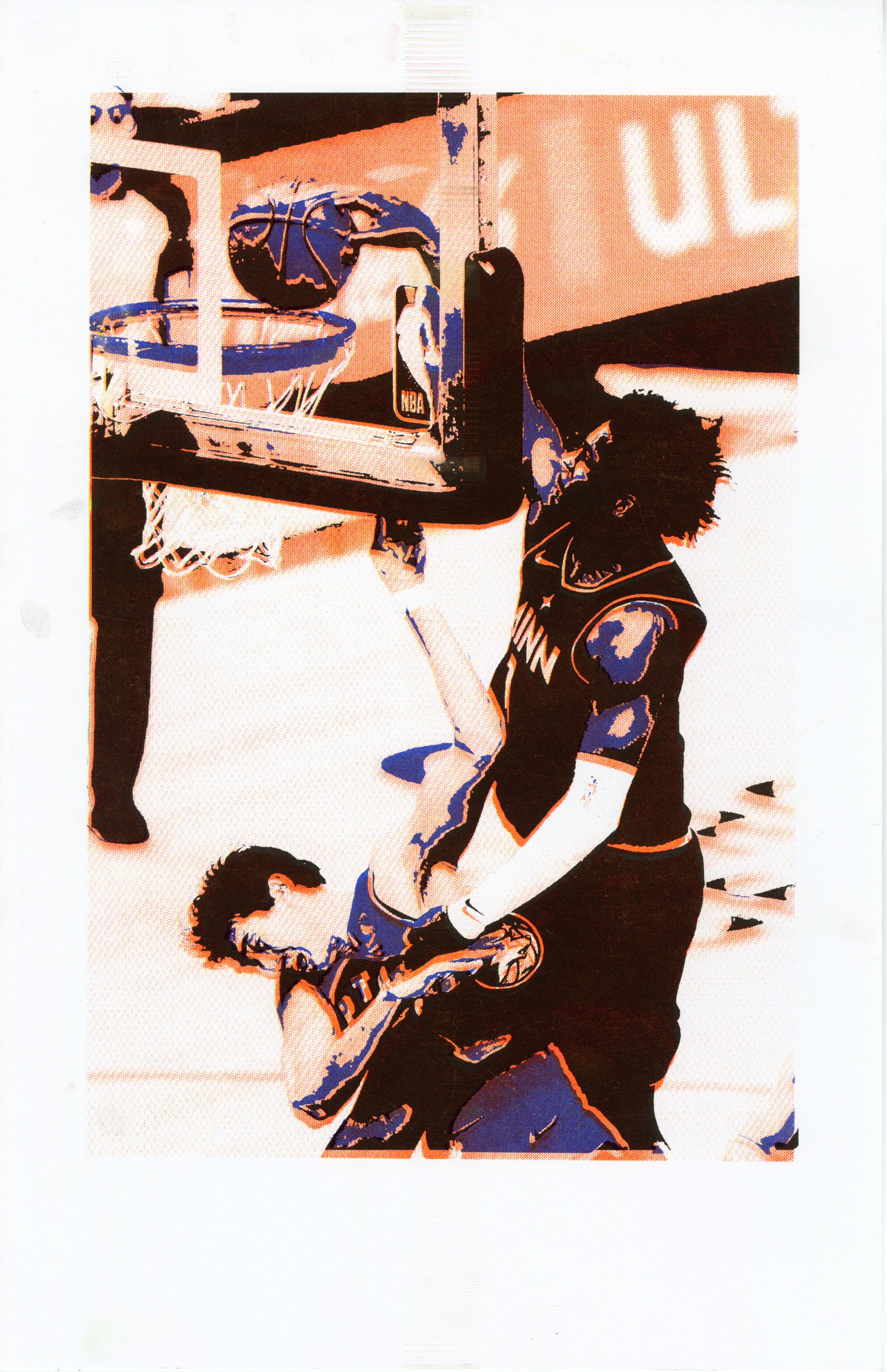
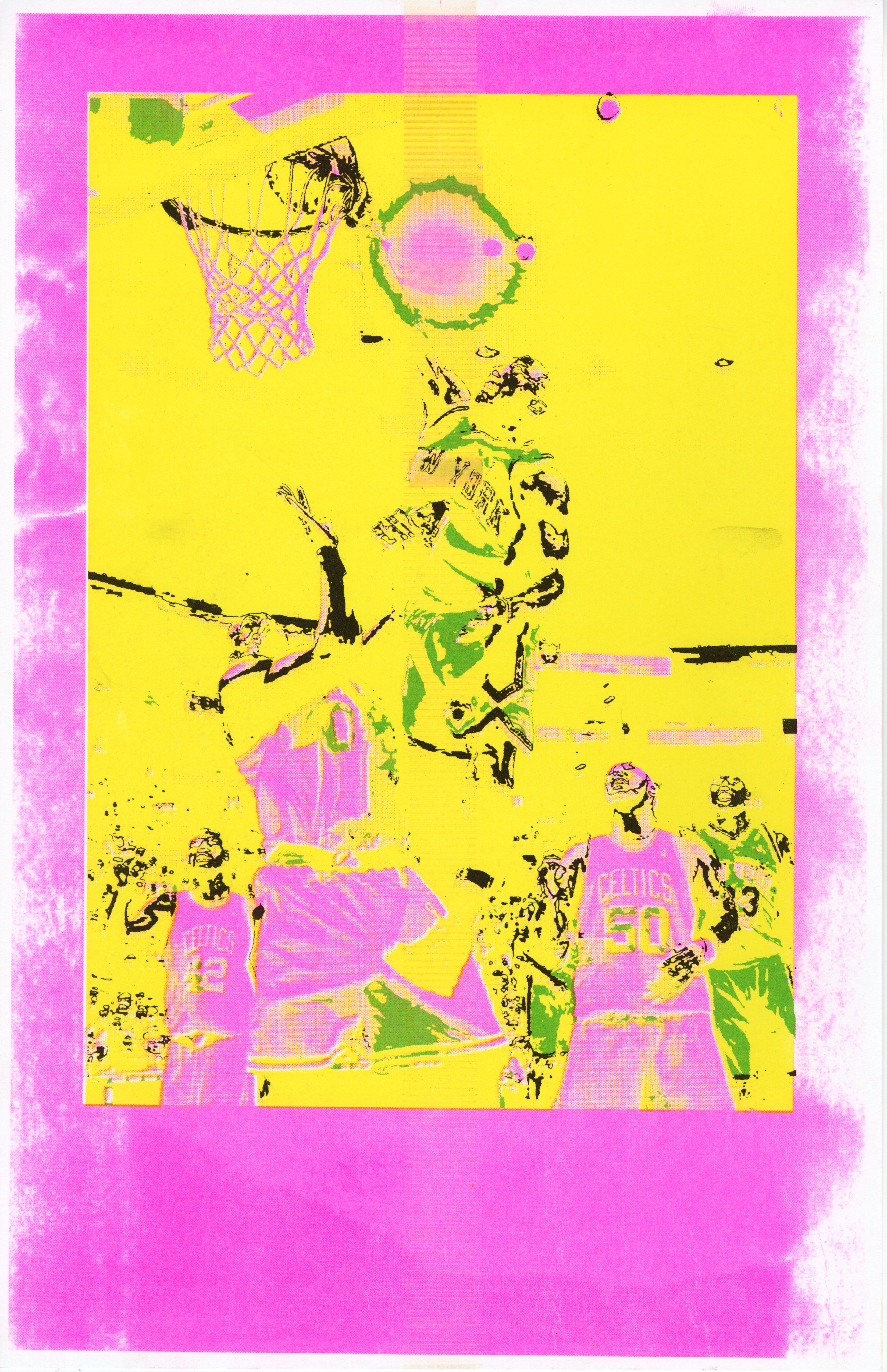
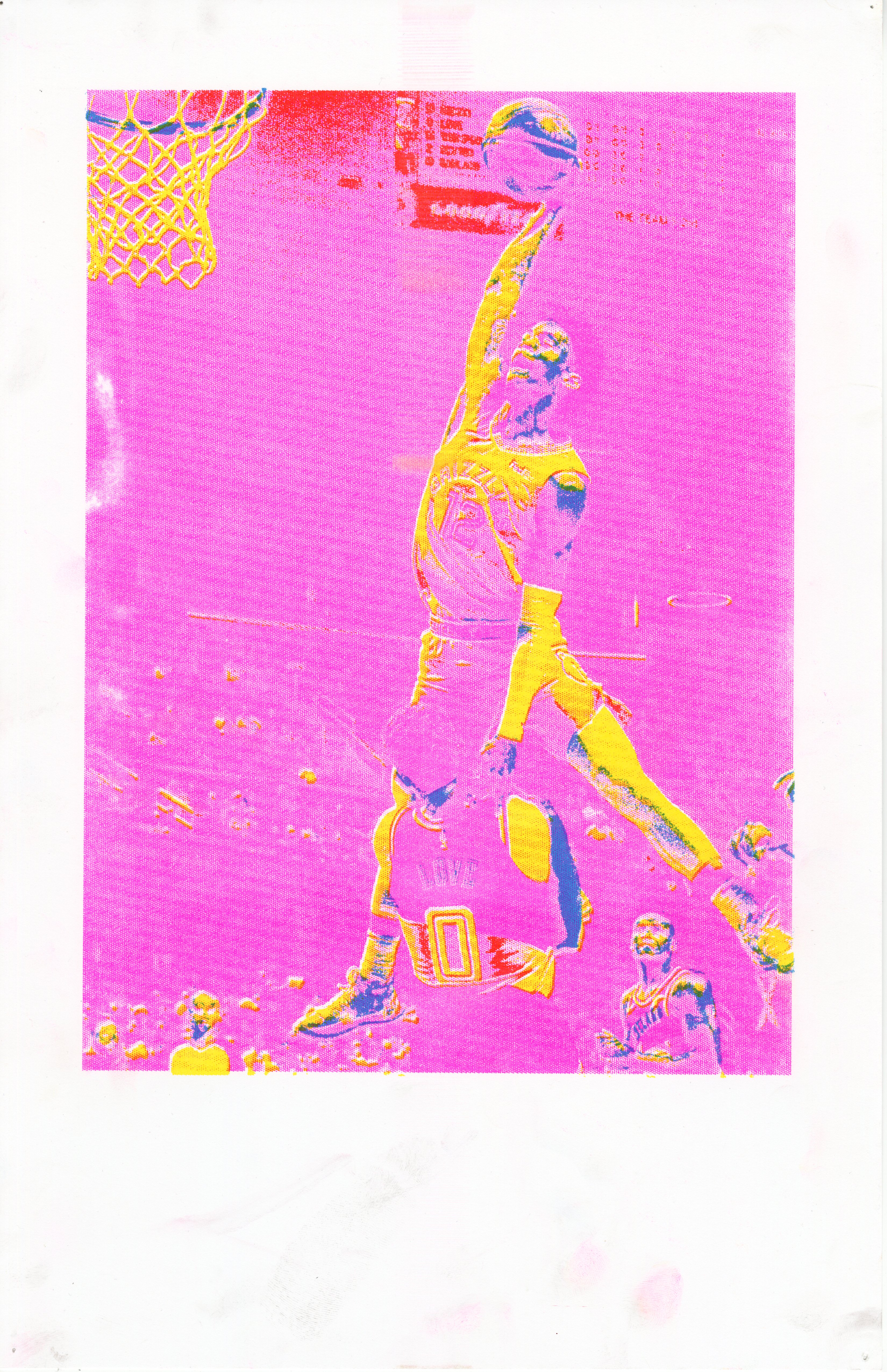
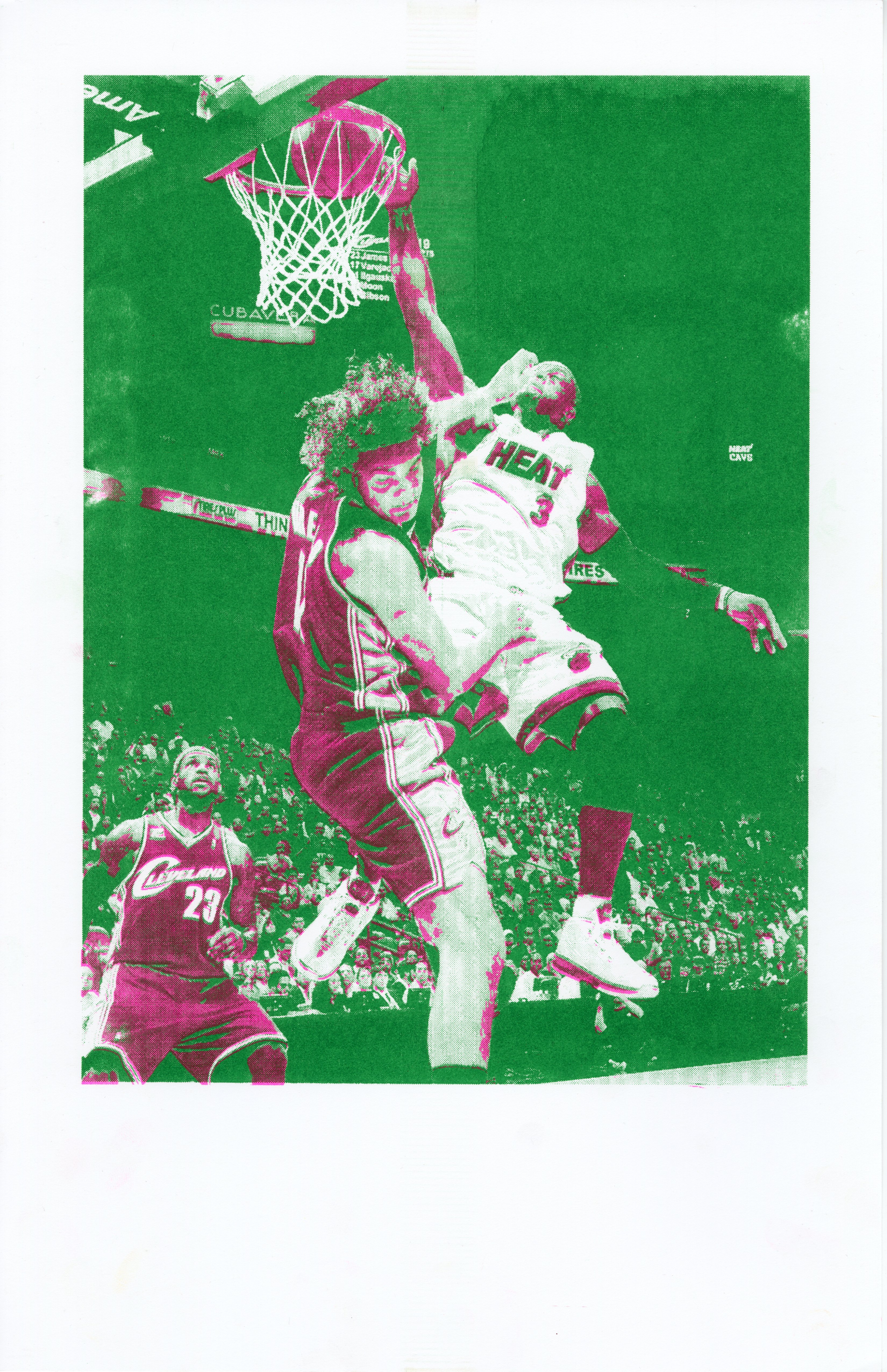
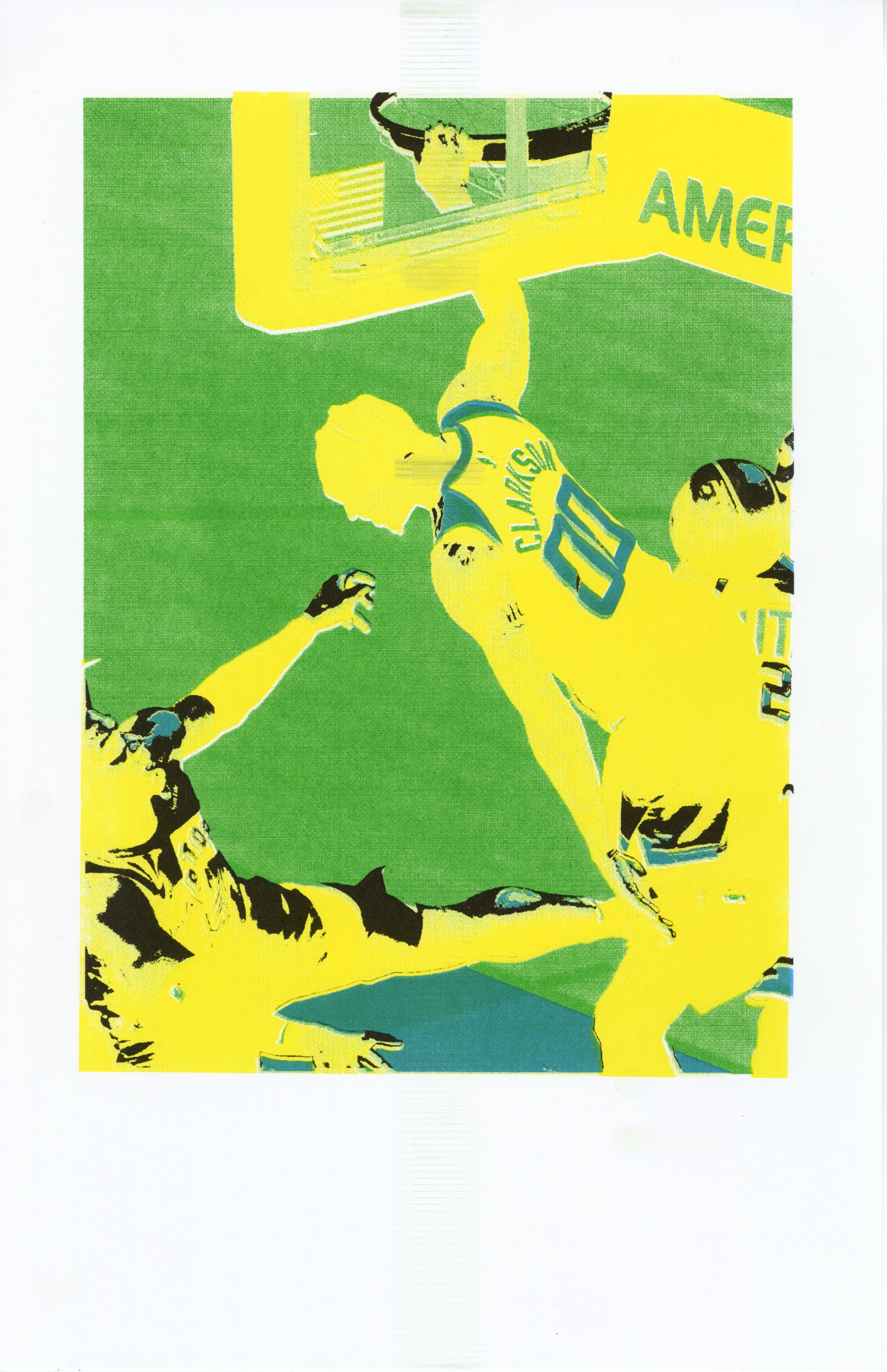
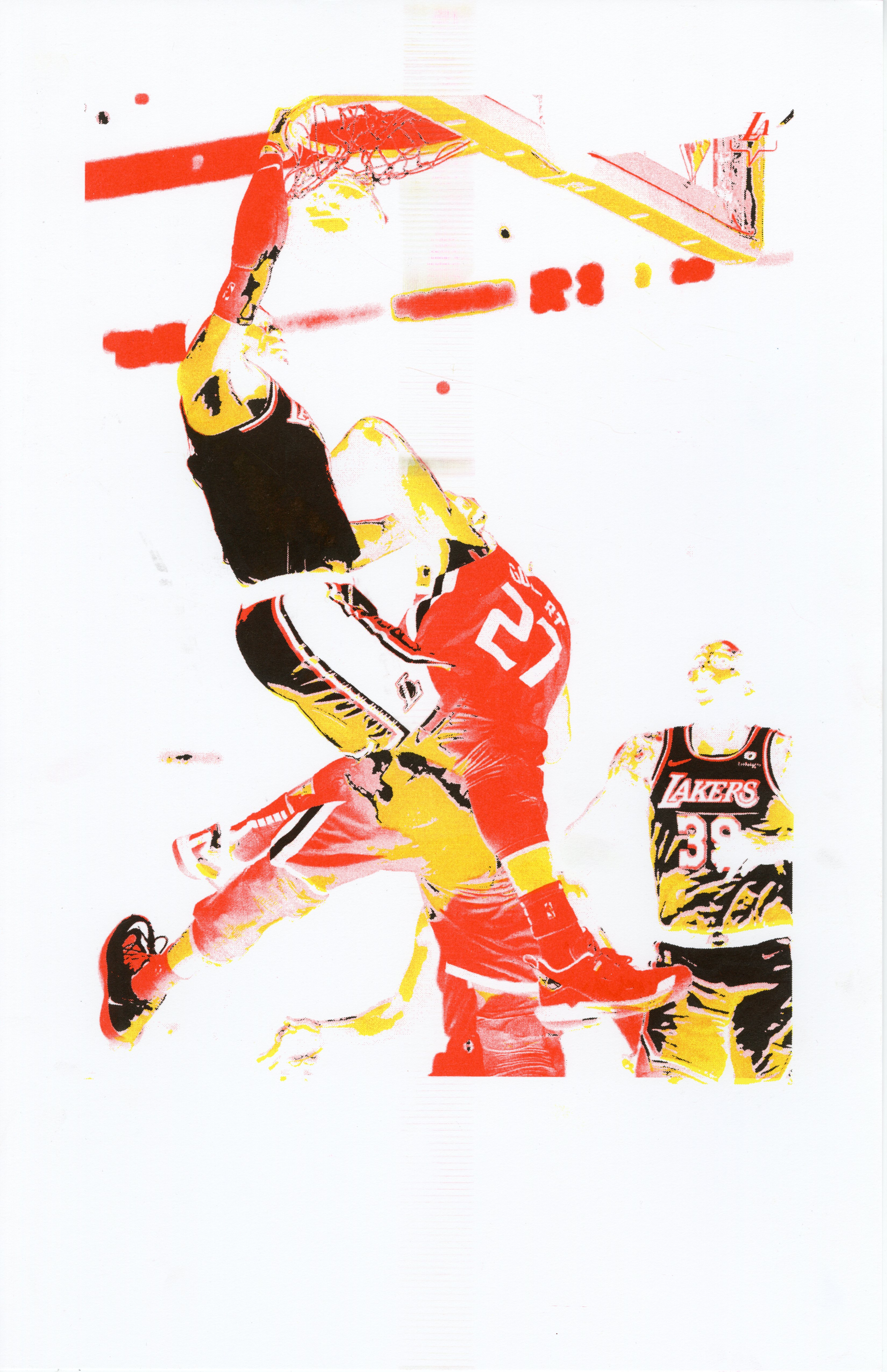
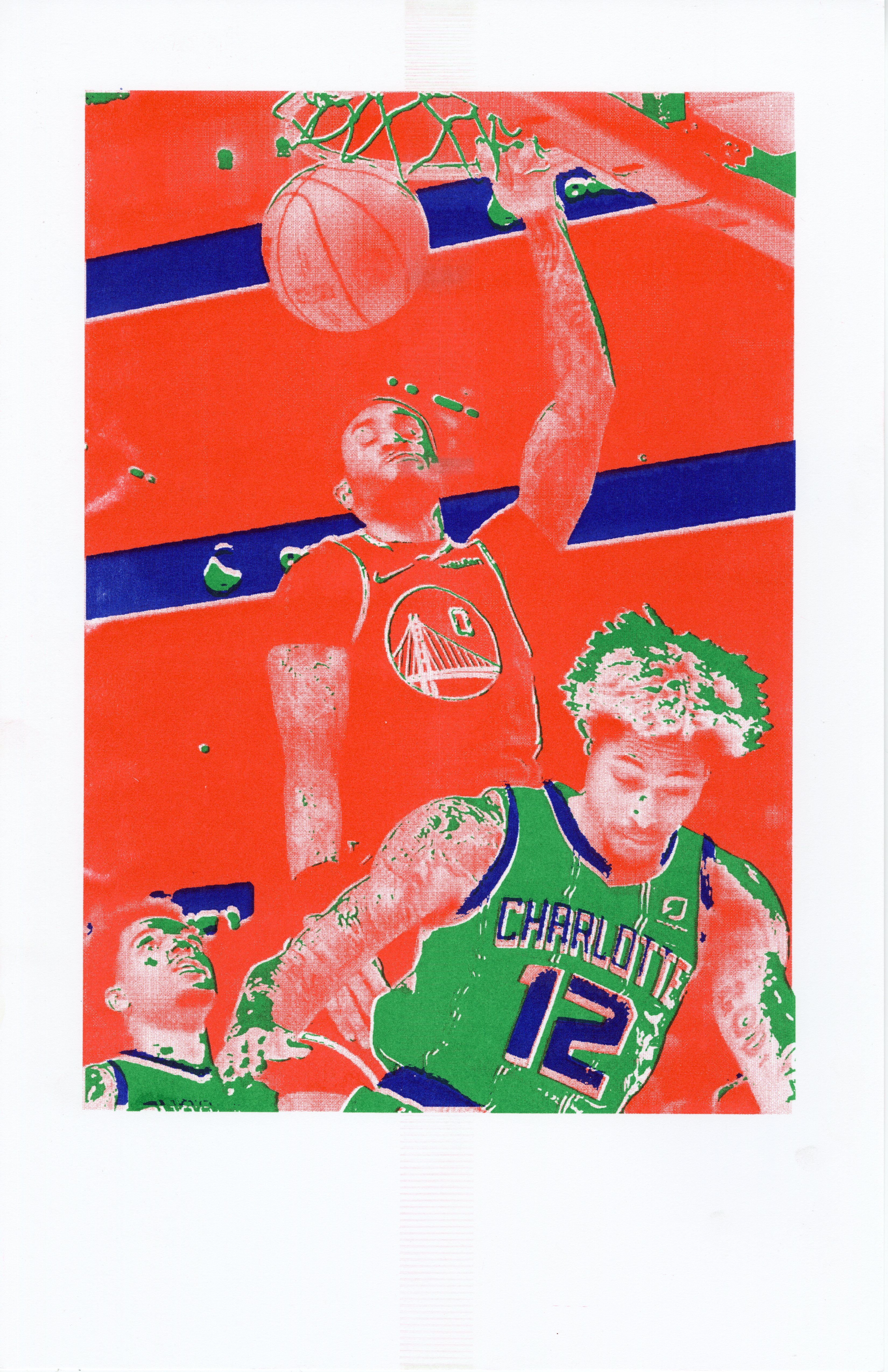
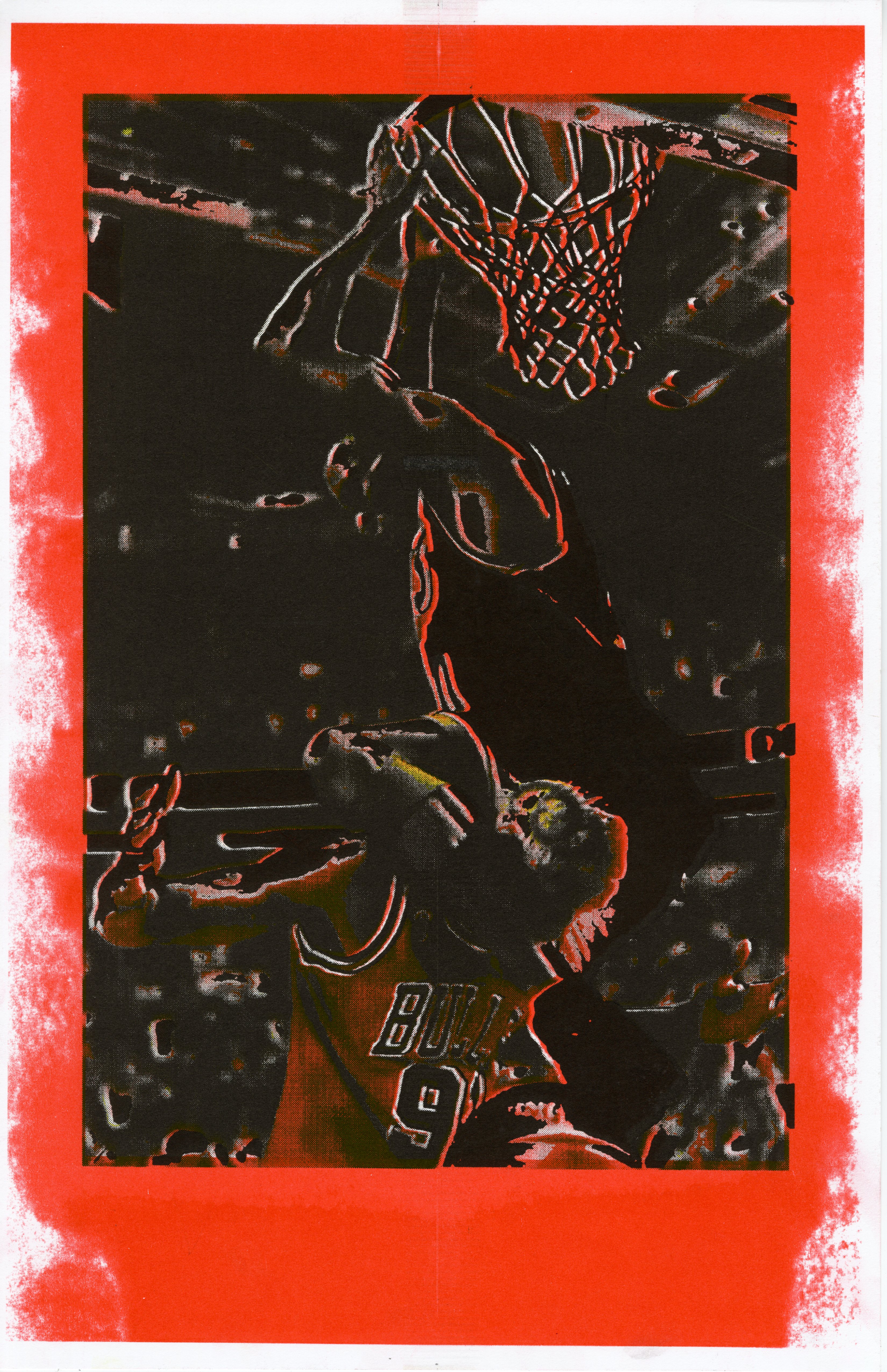
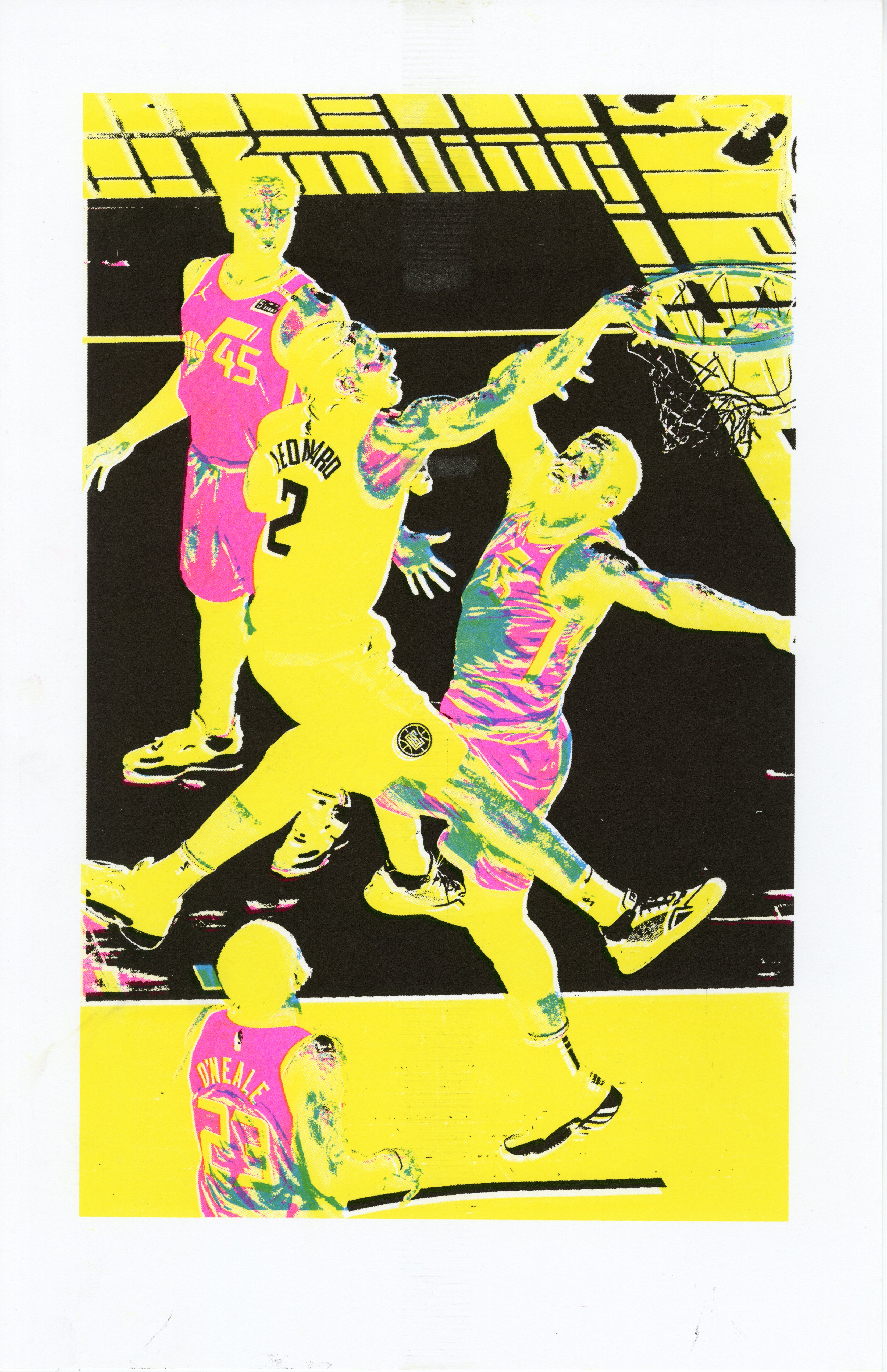
The Poster Dunk is an amazing action every basketball player and fan witnesses eventually. These aerobatic spectacles are some of the most magnificent displays of physical confrontation in all sports. As an offensive player drives the ball toward the goal, they are met with one or more defenders under the basket. Instead of stopping on a dime for a jump shot or using a finesse move to beat the contender(s), the offensive player decides to go directly through them and takes off towards the basket. The defender(s) rise to this challenge (literally) and meet the driving player for an aerial showdown. As their bodies float, there is a brief calm. Then the offensive player slams the ball down through the rim with the defender right in their face.
Most people know what a dunk is through pop culture, but a poster dunk is another level to this shit. This moment encapsulates many of the values within sports. Firstly, the offensive player displays one of the crucial pillars of great athletes, unwavering, ignorant confidence. Having the gall to say to a defender -- “I see you there, and I don’t care. I’m bringing it directly to you.” That takes a certain kind of fearlessness and commands at least a modicum of respect. Sometimes you need that kind of spark to get what you want. Of course, you’ll always need a measure of talent and work ethic to progress far in any field, but without believing that you can apply those things, you’re really nerfing yourself.
Poster dunks are also a 1-1 instant simulation of winners and losers. They’re a glorious triumph for the dunker and an epic loss for the defender. The close-range nature of these confrontations carries an emotional weight that’s slammed on spectators at the moment of impact. It’s more than Ws and Ls; this is personal. In terms of instant and explosive shifts in energy, poster dunks are the most powerful actions in athletics. The way they inflate or take the air out of a stadium is wild.
It’s believed the term posterized was first used to describe dunks by Dr. J that were worthy of being printed on posters. During the 80s and 90s, sports were consumed a lot slower than now; The main difference is print media prevalence. Before you could reach in your pocket and ask Siri for box scores, you’d need a newspaper if you missed a game and wanted to know the result. Magazines also played an immense role in telling the stories of athletes and building the lore of legends. Posters were the large-scale statement pieces that tied this trifecta of printed matter. Since they had the potential for the biggest images, it was reserved for the most iconic of moments, dunks. Basketball fans relied on these photographers and graphic designers to archive the moments that captivated them. Hearing dunkers like Tracy McGrady and Vince Carter talk about how they covered the walls of their childhood rooms with posters of Dominque Wilkins and Michael Jordan dunking on people is so cool. TMac and VC’s performances were clearly influenced by these guys, as it was their generation that would redefine the term. It’s an entirely different thing for current-day NBA fans and athletes.


The in-your-face-style dunk I described earlier is the definition people use today for is more in line with the way people use” posterize” today. A dunker posterizes a defender. When Lebron James dunked on Kevin Love this past March, he went directly over him, making for an epic image. If this photograph were to be used for a Lebron James poster in a Nike Campaign, Love and his defeat would inevitably be a part of it.]
In my research about poster dunks, I was only able to find about two or three posters of actual poster dunks. Which is wildly underwhelming given how famous these moments are and how widely this phrase is used. As the media landscape has changed, so has the way these moments get archived. The invasive efficiency of targeted internet ads has decimated print publications. Magazines have primarily been replaced by social media platforms that increasingly prioritize video content over photographs, especially within the past 5 years. Now, getting posterized is more of a reference to social media posts than actual posters. We’ve gained the 1-1, 4K Ultra HD documentation of events, but we’ve also begun to phase out the snap shot.
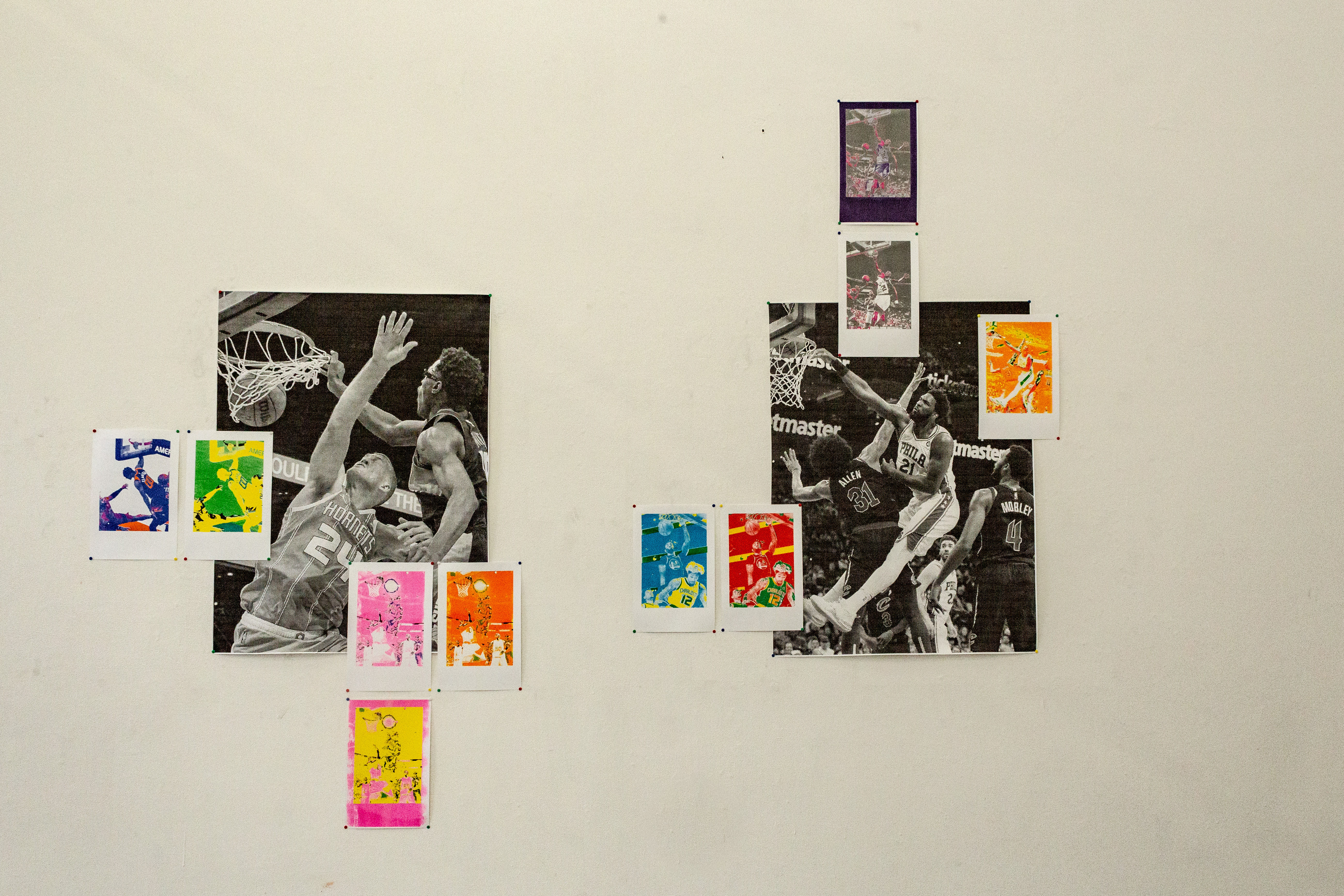
Posterized is a tribune to this iconic moment, and the iconic still image. I curated this series of poster dunks and printed them on posters in reaction to the changing media landscape. The images are treated by using Photoshop’s posterize filter to create risograph layers. This process generated many results ranging from stylized documentation to psychedelic abstraction.
FIELDS OF PLAY


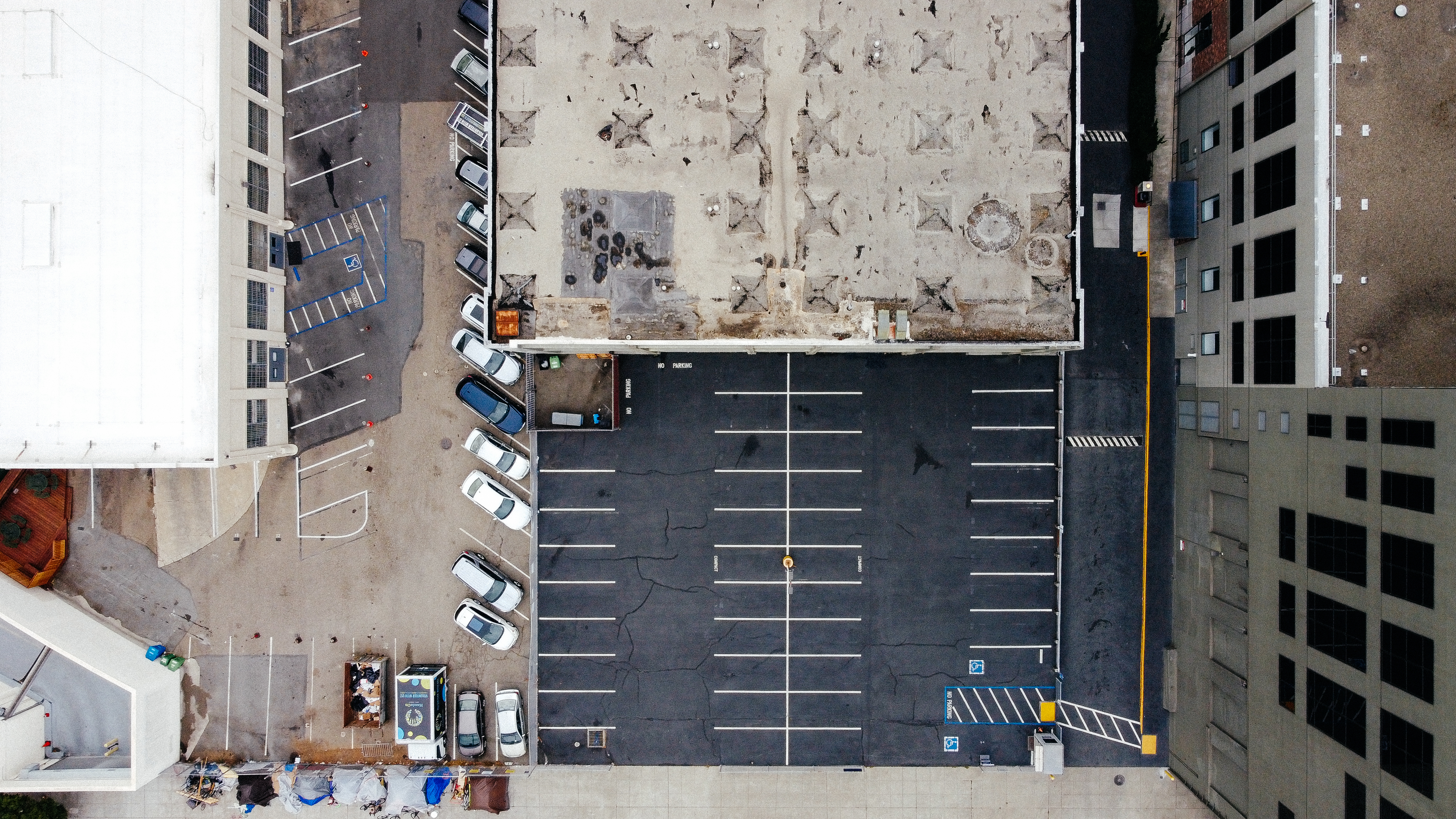


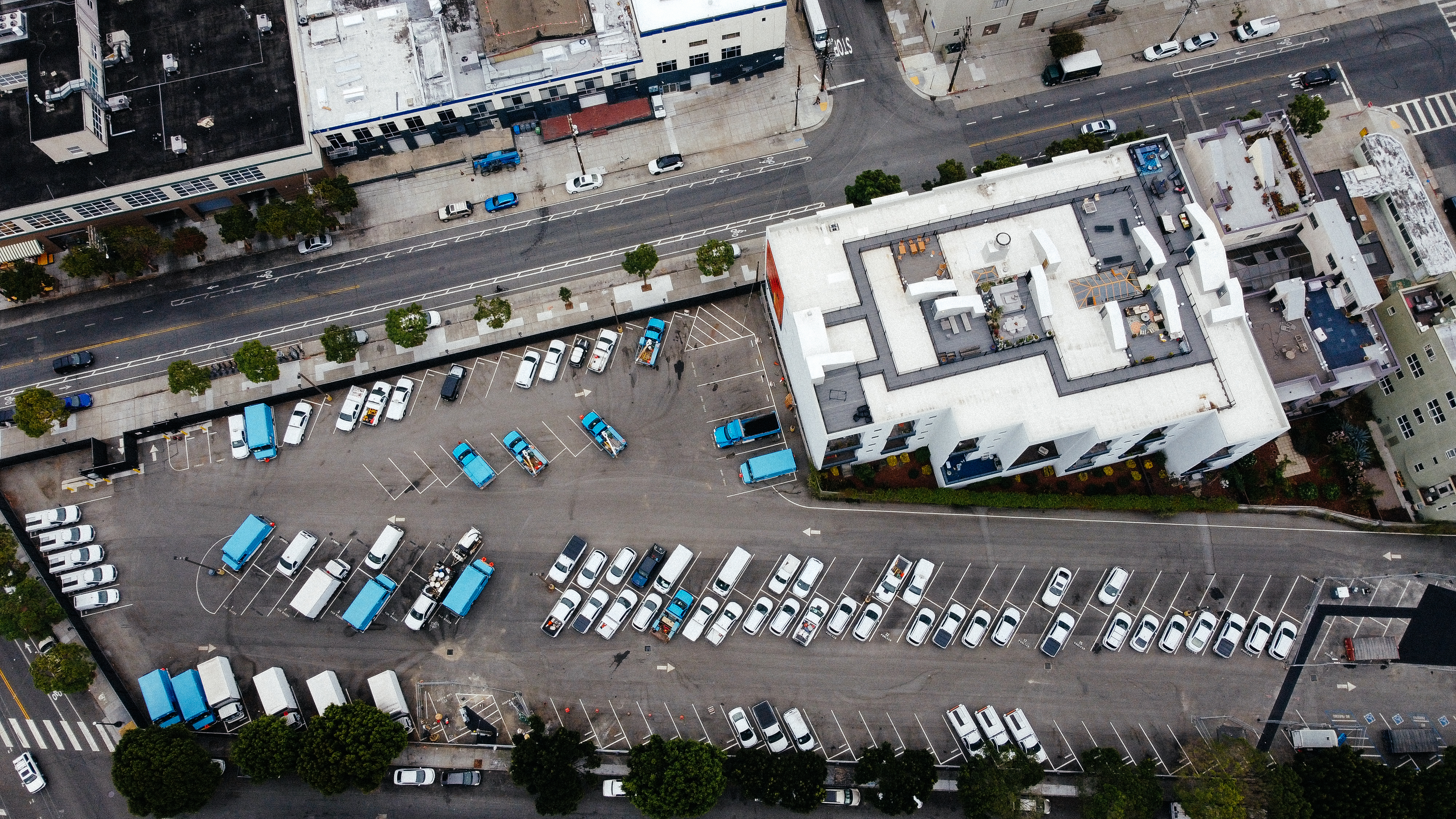


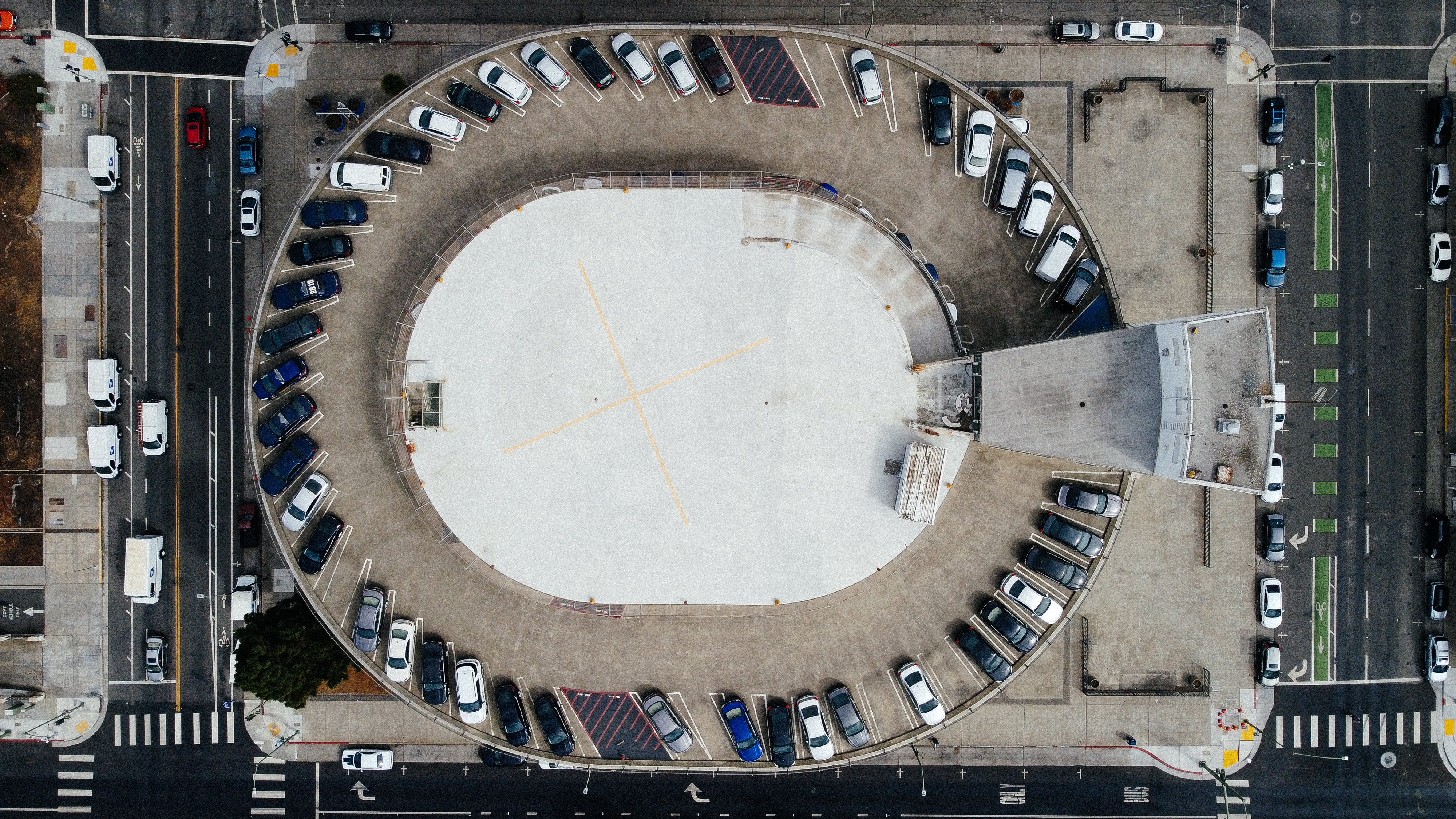
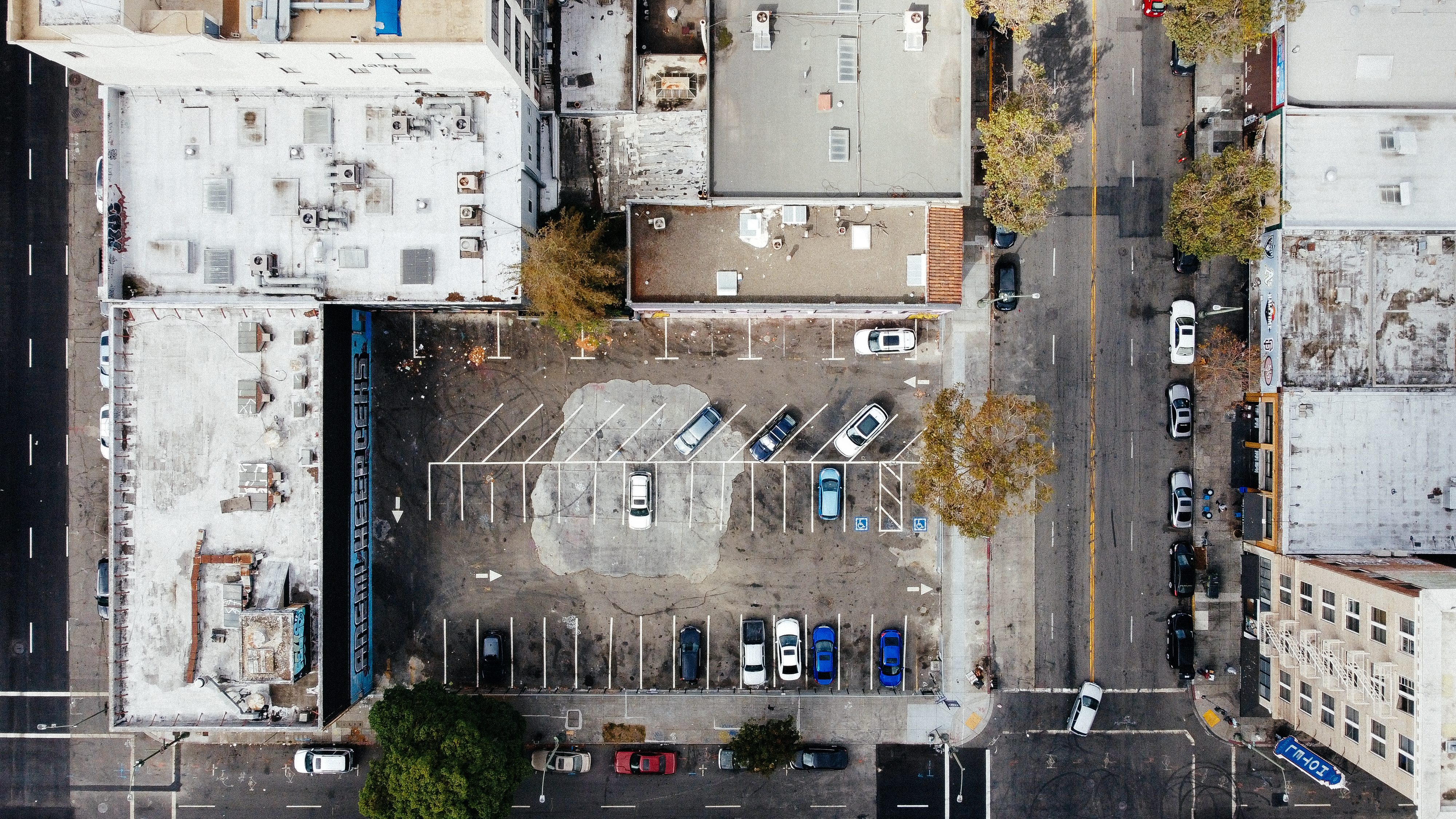
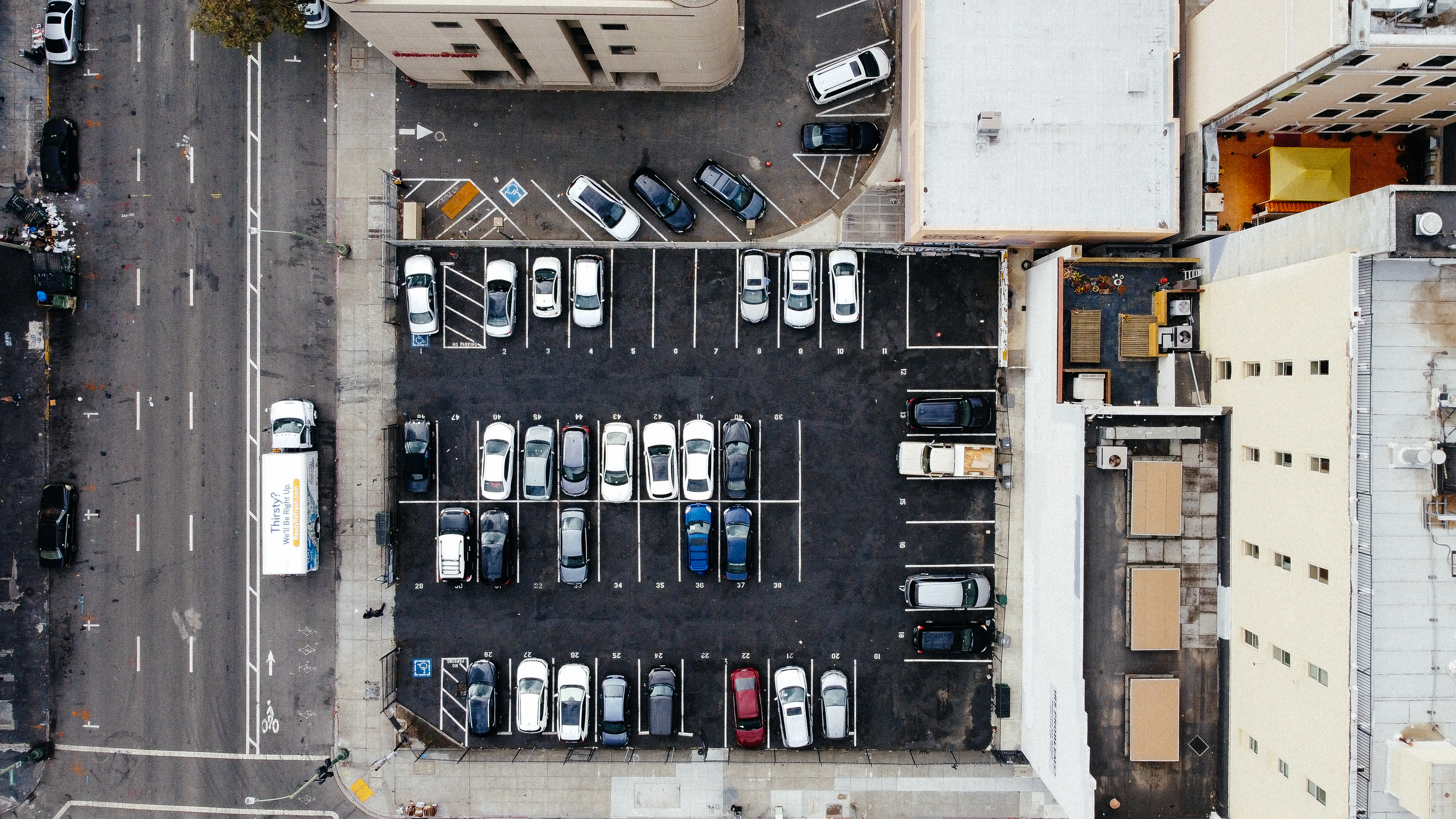
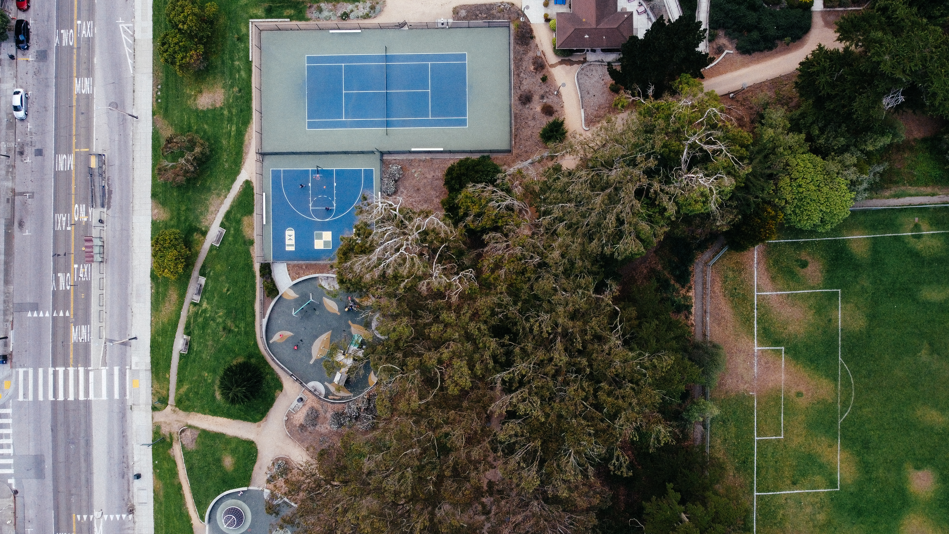
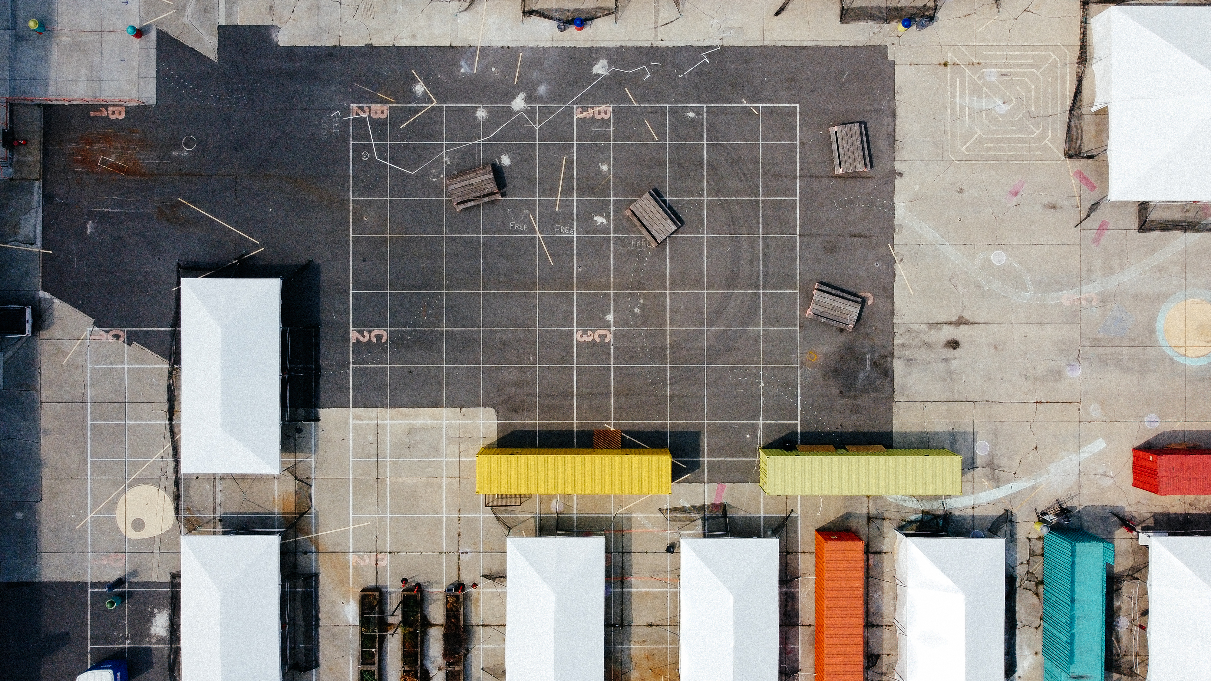

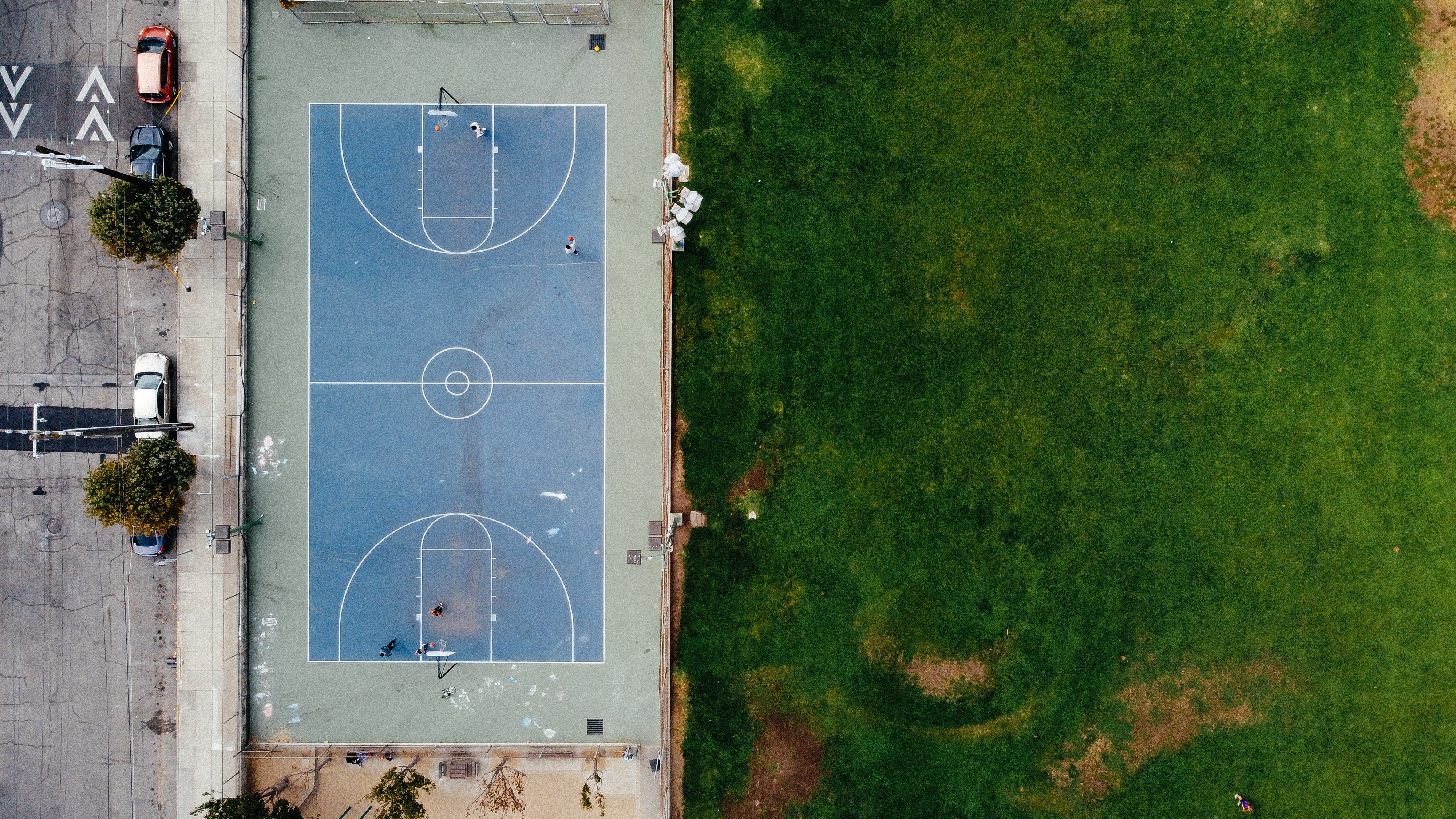

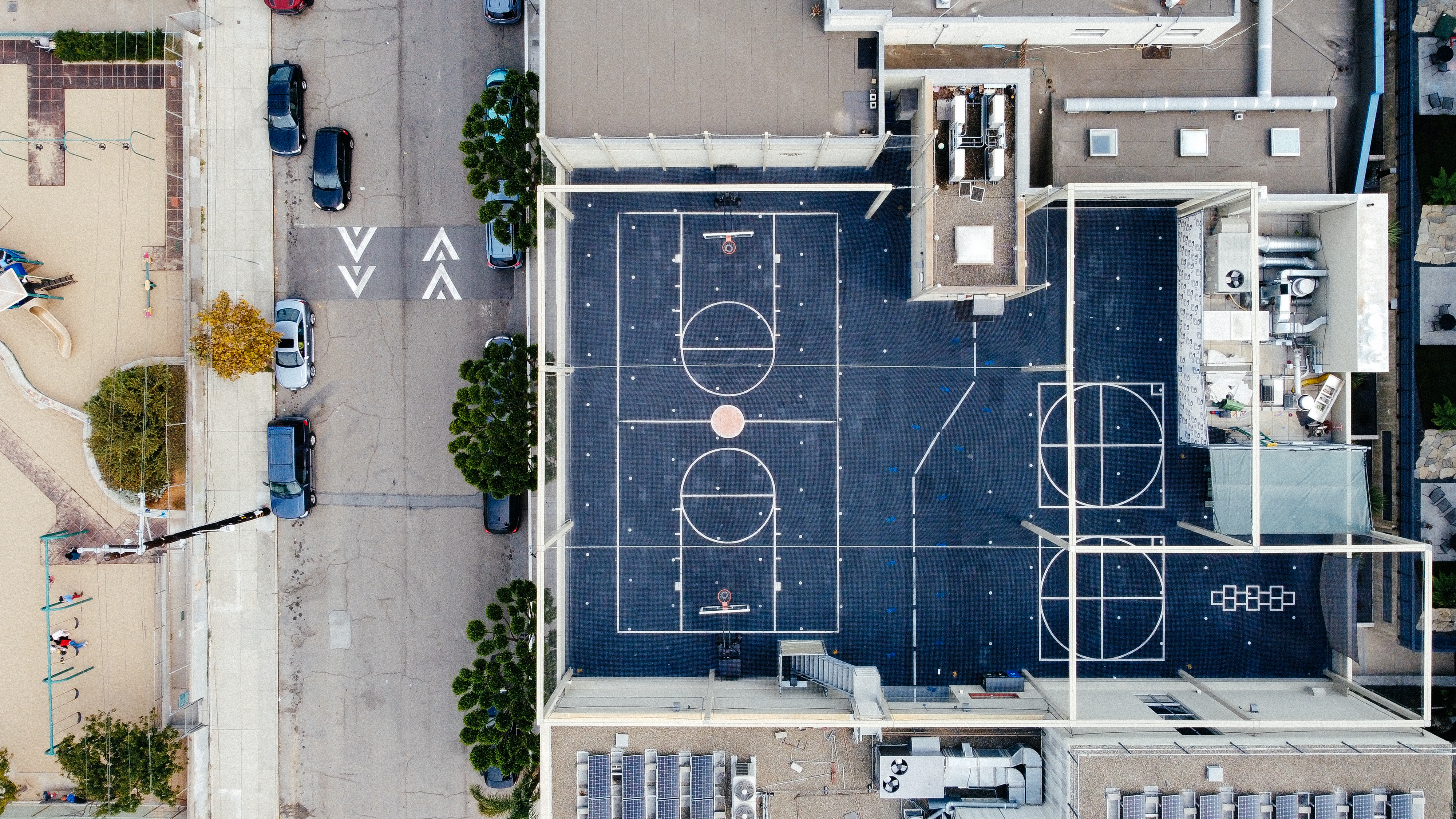


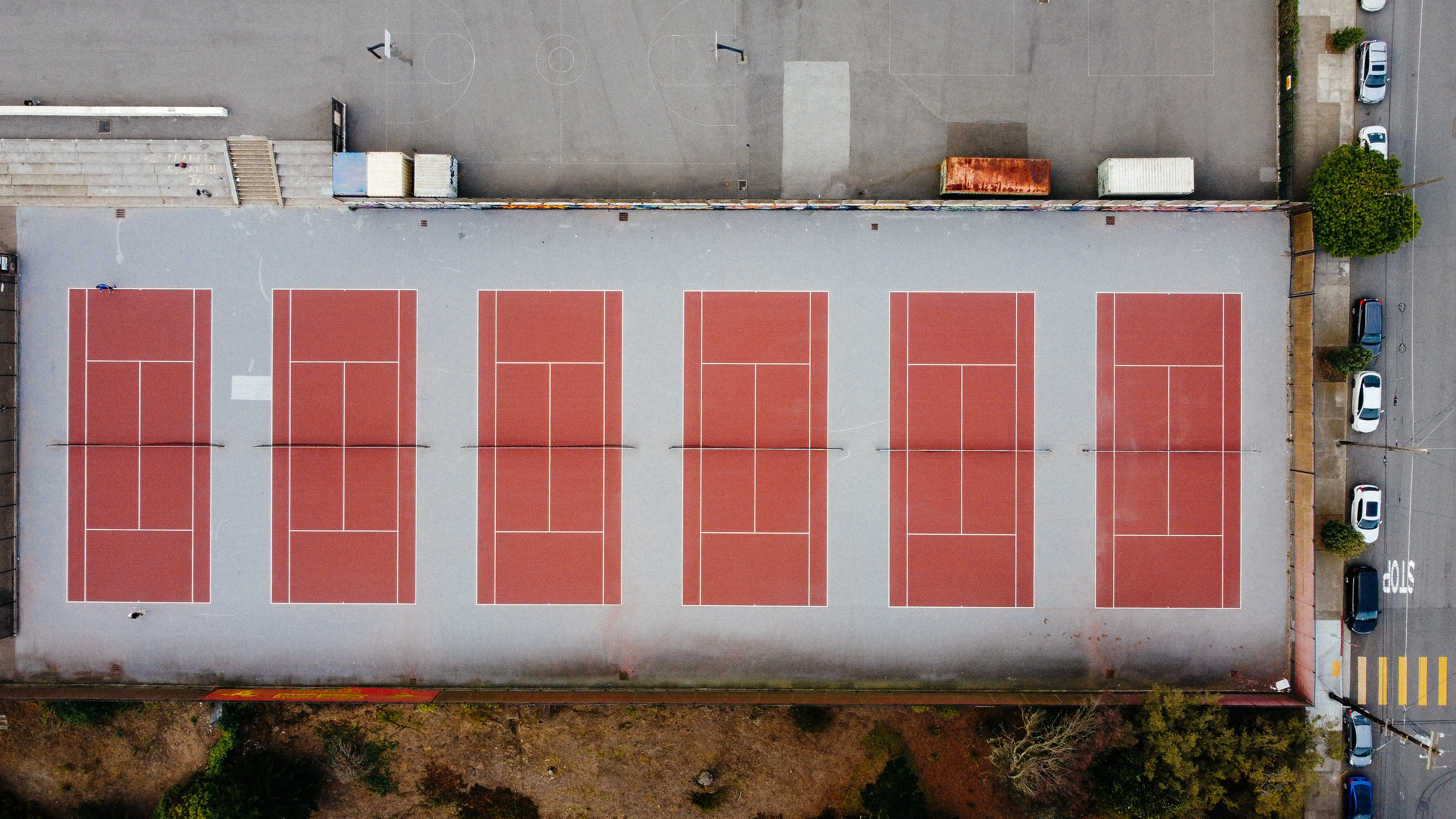
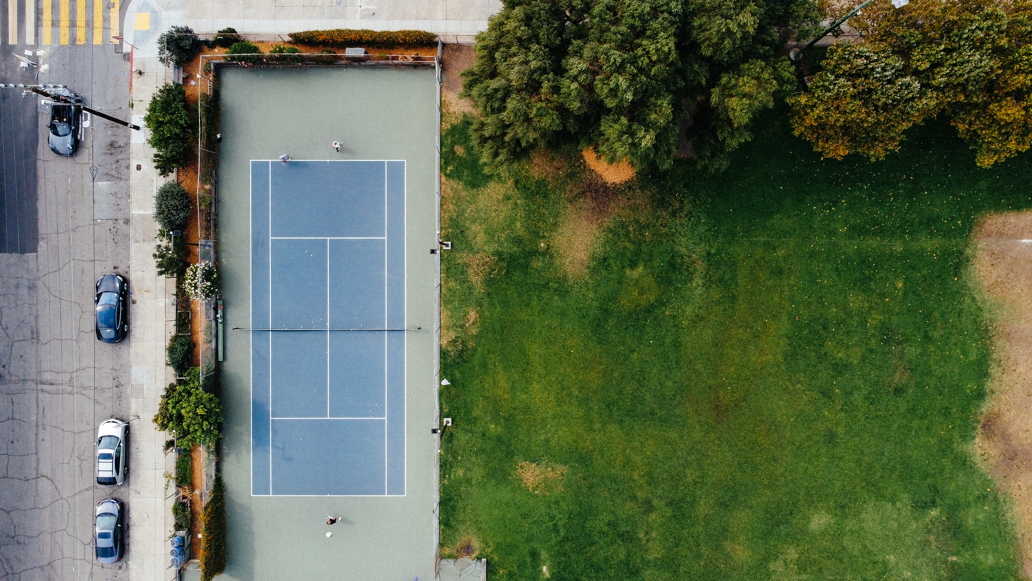


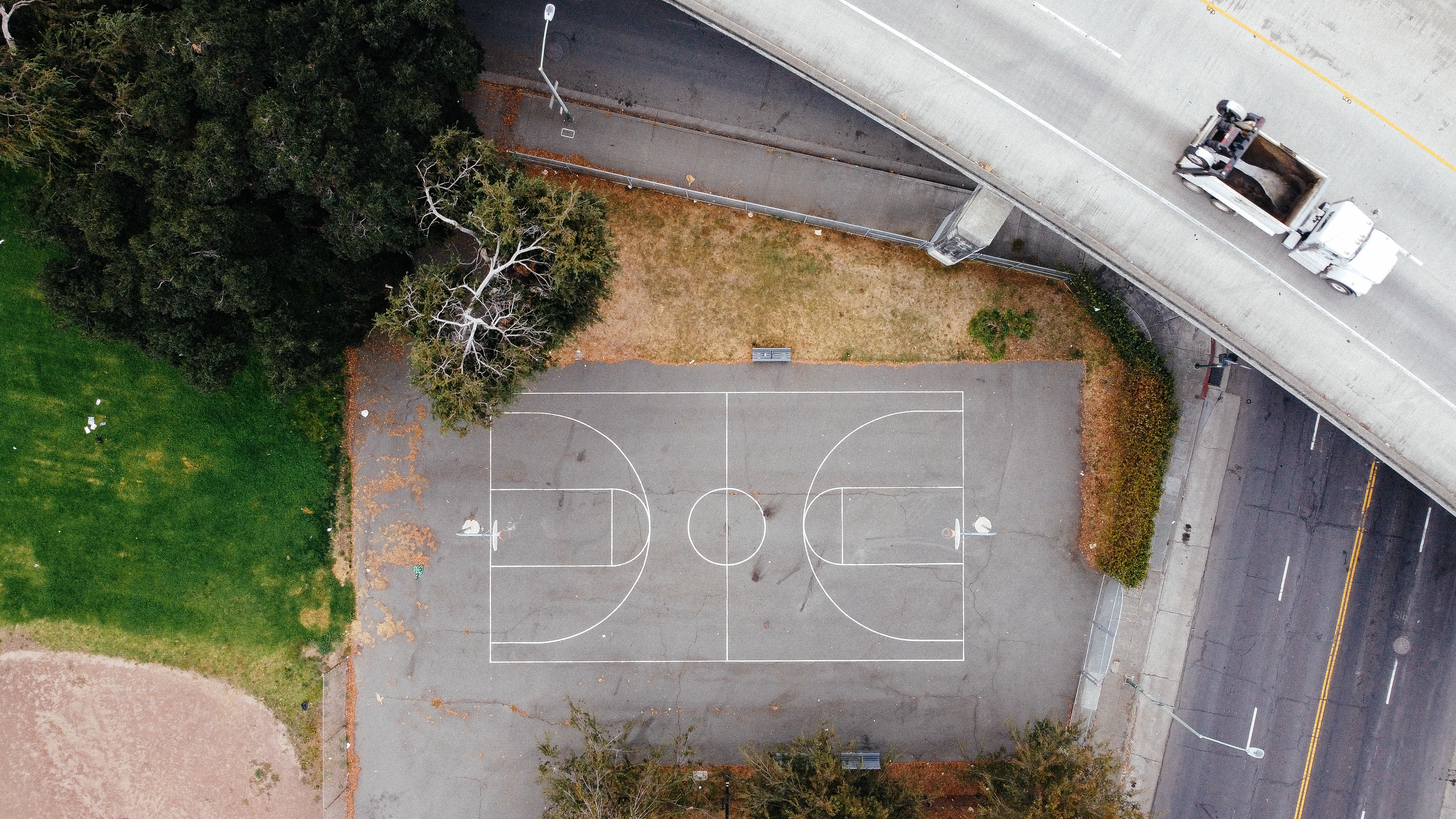
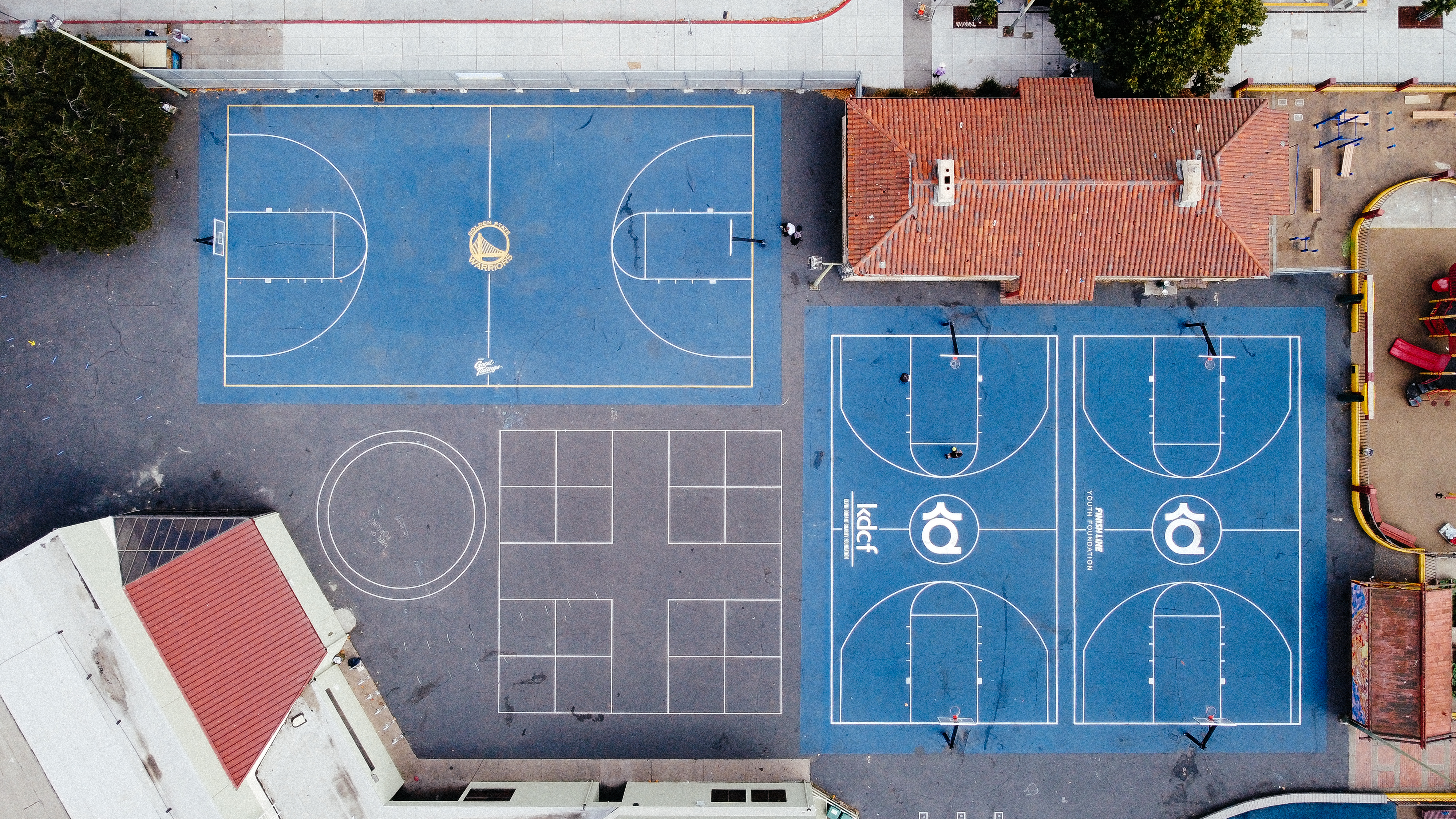


Boundaries take many forms. The rules of space direct its traffic and function. Sometimes boundaries are physical, like a net, fence, or partition. Others are utterly intangible, like the 6-foot buffer we keep while social distancing or the security of your wifi router. No boundary is the perfect mix of the physical and the psychological than lines painted on the ground.
This project started at the Safeway Parking lot on 16 street in Potrero Hill. On my visit to the site, I noticed a soccer field across the street. A few players were jostling for the ball down the sideline until one of them kicked it out of bounds. As a player finally retrieved the ball, play stopped for a moment, and I shifted my attention back to the parking lot. In the distance, there was a car parked very disrespectfully. The driver completely ignored the white lines painted on the ground. At that moment, I became fascinated with the white lines that frame space. Like soccer fields and basketball courts, parking lots have winners and losers. In the former, they compete for points, & in the latter, for the space itself.
X’s and O’s


During Fall 2021, I attended a typography workshop held by Martin Venezky. The event began with a lecture about various artists, and this is where I was introduced to the work of Wade Guyton. He has a series of untitled works where he prints the same X over, and over and over again on a white canvas using a custom-built Epson printer. The prints are very simple, but they left a strong impression on me. I love analog processes and tools that have the potential to surprise or unexpected results, but I also need the precision and ease of working on computers (perhaps a result of being a 90s baby).
Guyton’s prints served as the principal inspiration for my next project, X’s and O’s. Just as he repeatedly printed the same X with an Epson printer, I also used my own to retry this process. Guyton was thoroughly interested in the fundamental relationship between man and machine. The pride of modern-day printers is that they can deliver exact multiples of a file quickly and at a high quality. Doing the same print on top of itself allows one to observe the tiny imperfections accumulated. The X he used was a reference to programming languages and consumers software interfaces.
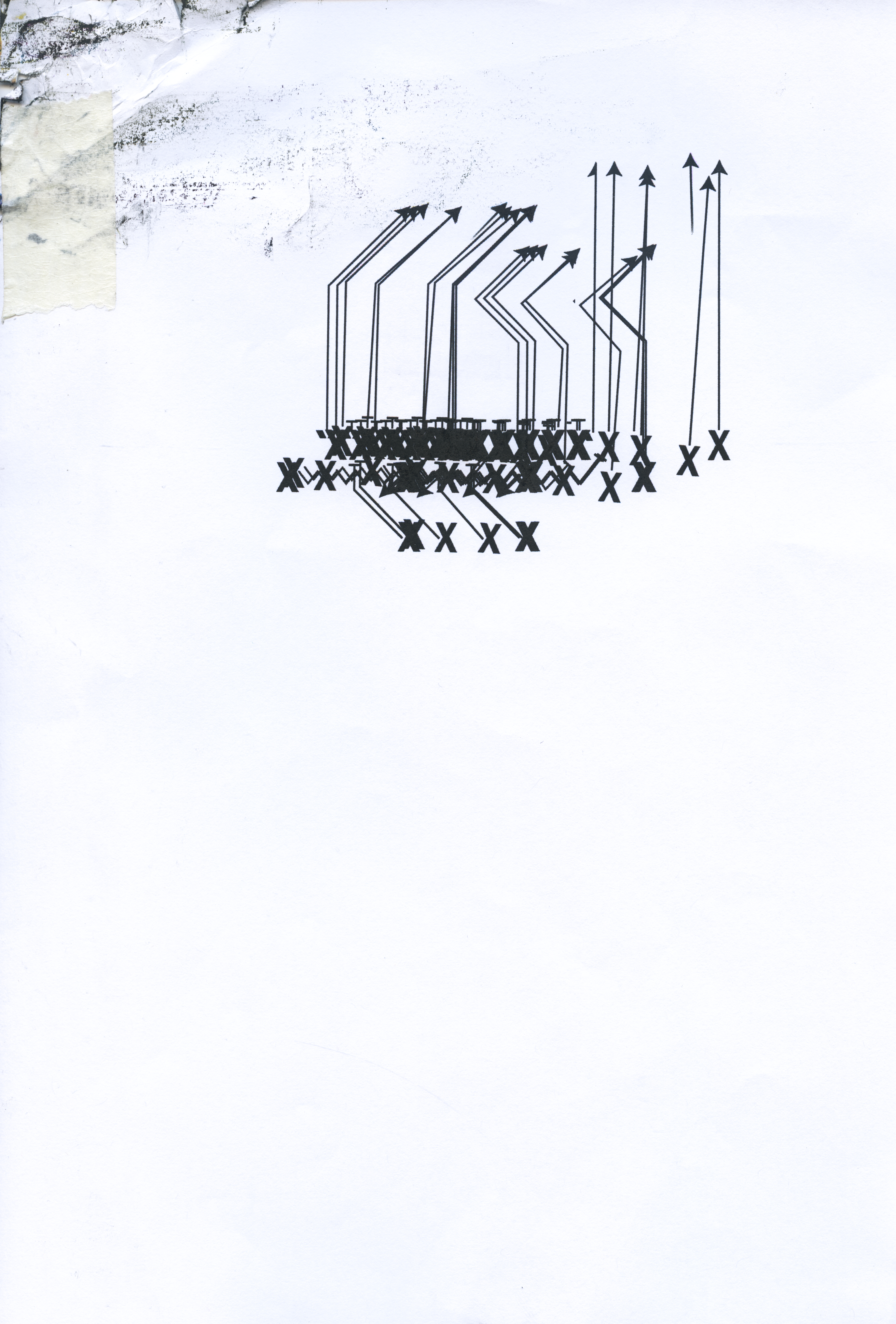
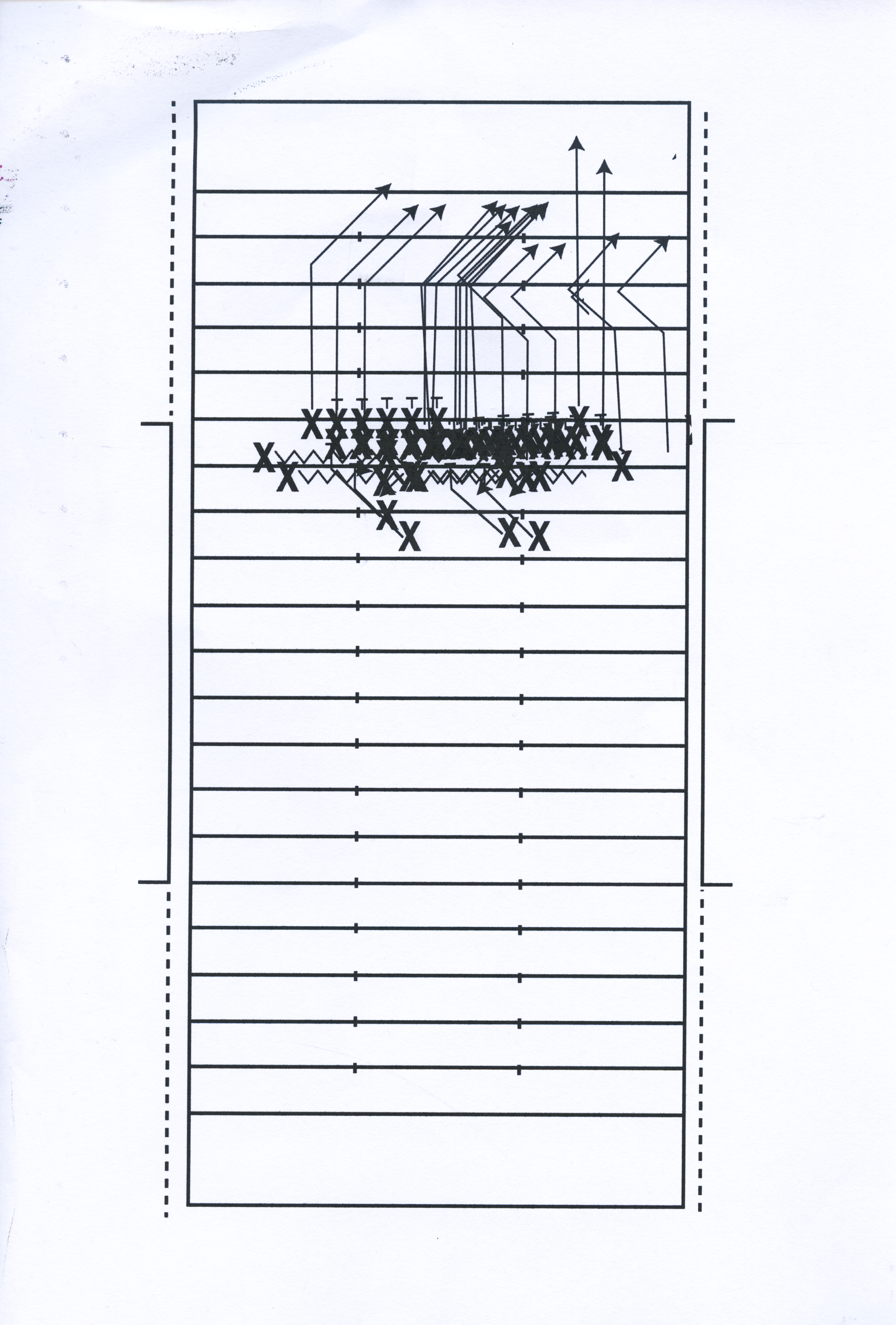
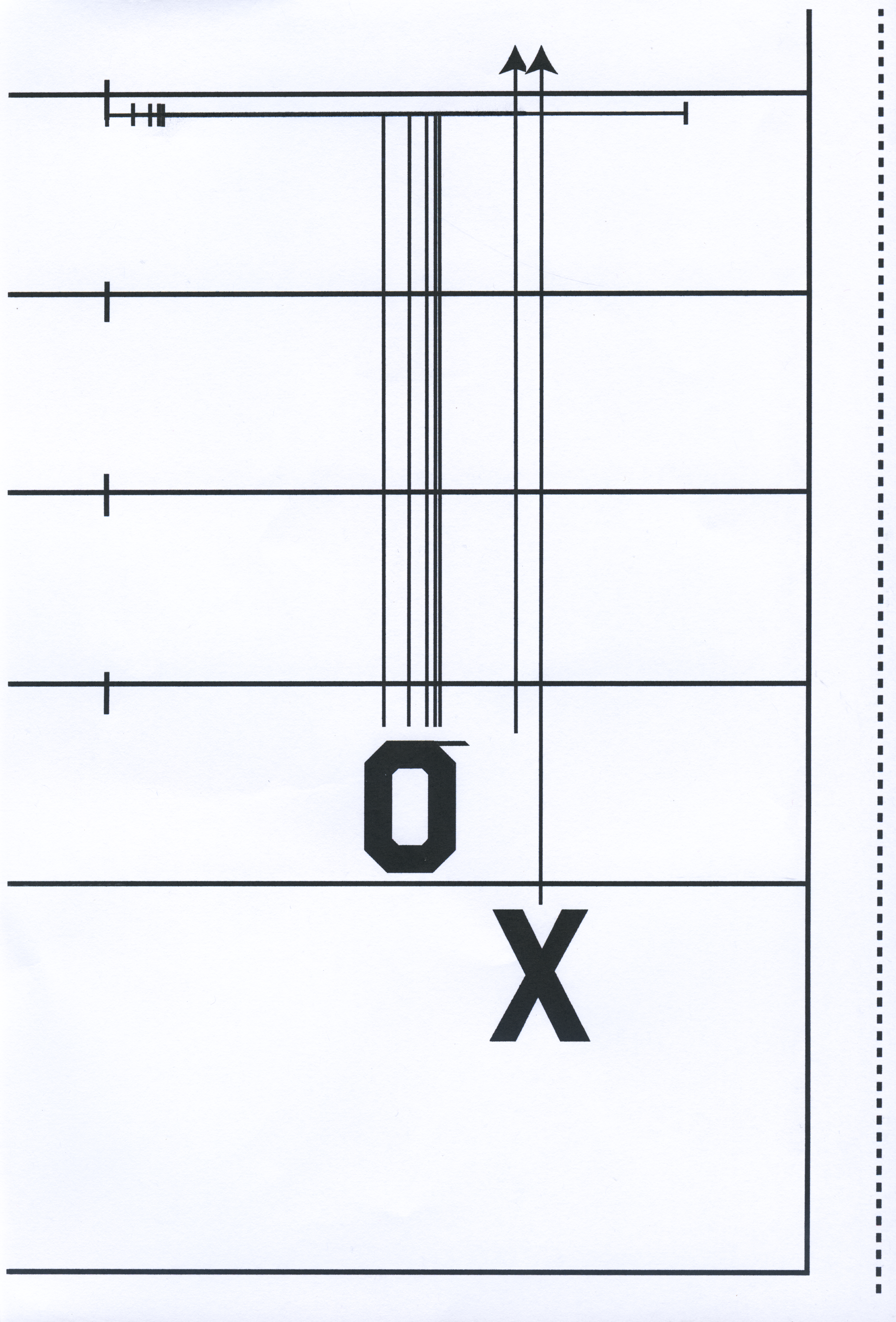
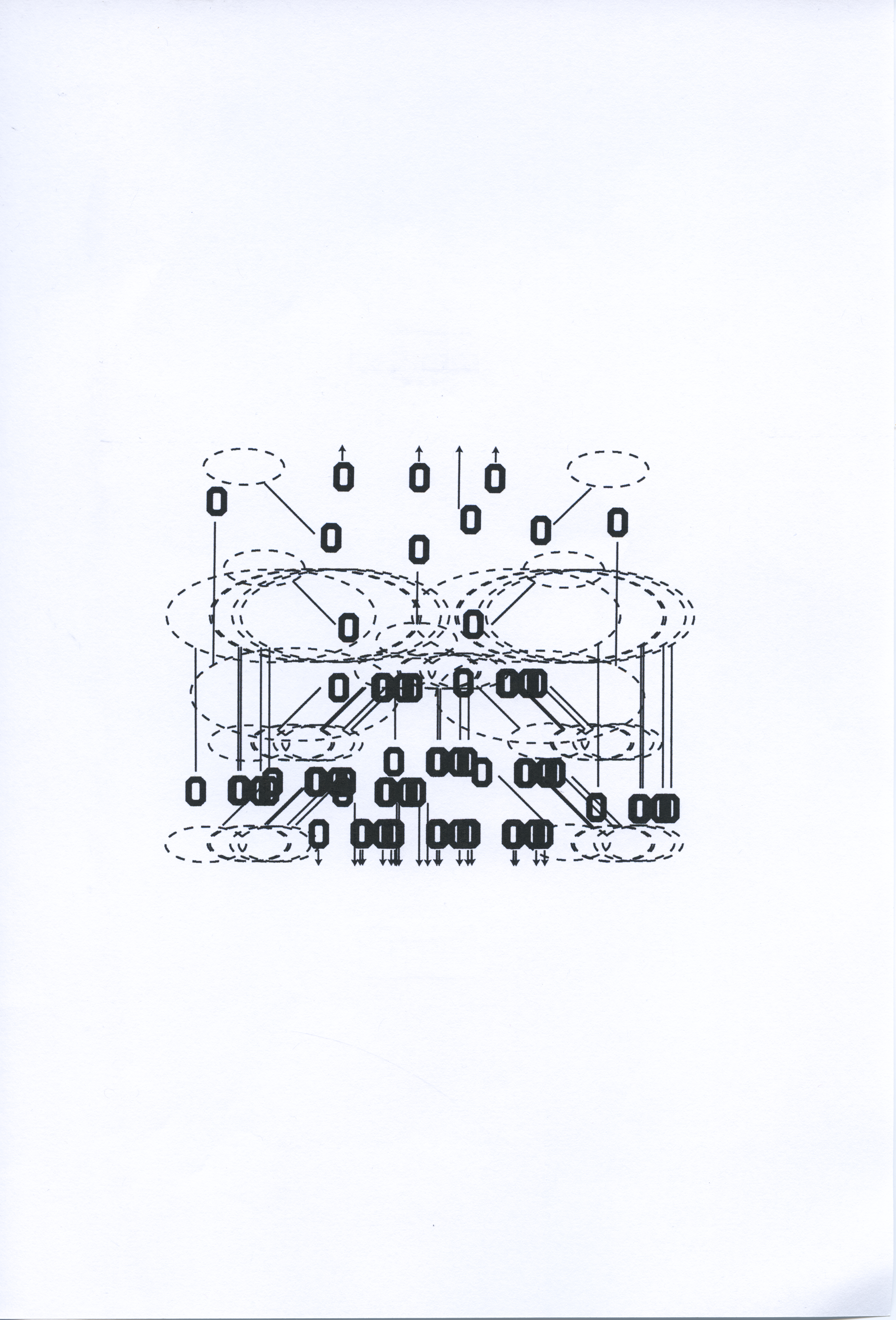
I wanted to use an X for my experiments, but I also wanted to continue my methodology of sampling graphics from sports. When researching graphic assets, I thought back to my high school experience as a football player. Each summer before a season, team members would receive a packet from the coach with essential information like the practice schedule and standard procedures. The most significant portion of the packet was the playbook. They were set up with a straightforward typographic system and visual elements to differentiate the offense from the defense and represent what’s happening in each play. Both sides of the ball were always noted by using only X’s or O’s for each position active within a team’s formation. This would be done on top of a scaled-down version of the field, which served as a grid to lay out how players would space themselves in an actual game. Their task/objective would be noted with vectors stretching out from their X/O. The direction of the vector would show where they were supposed to go, and the tip of the vector would tell them what they needed to do.
These elements used in the context of my thesis work create a different type of poetry than Guyton’s. Repeatedly printing plays has a metaphoric relationship to the players on a field. After studying a playbook all summer, we would come back to school in the fall and spend practice performing the plays repeatedly. We’d reset the ball to the same place on the field each time rather than advancing down the field. Printing these plays allowed me to metaphorically coach football practice using graphic design. I decided which plays to run. I decided what players would be on the field and how many times each play was run. Just as in real life, some of my “players” sustained injuries that needed to be taped up before they ran through the play again.
Guyton’s prints served as the principal inspiration for my next project, X’s and O’s. Just as he repeatedly printed the same X with an Epson printer, I also used my own to retry this process. Guyton was thoroughly interested in the fundamental relationship between man and machine. The pride of modern-day printers is that they can deliver exact multiples of a file quickly and at a high quality. Doing the same print on top of itself allows one to observe the tiny imperfections accumulated. The X he used was a reference to programming languages and consumers software interfaces.
I wanted to use an X for my experiments, but I also wanted to continue my methodology of sampling graphics from sports. When researching graphic assets, I thought back to my high school experience as a football player. Each summer before a season, team members would receive a packet from the coach with essential information like the practice schedule and standard procedures. The most significant portion of the packet was the playbook. They were set up with a straightforward typographic system and visual elements to differentiate the offense from the defense and represent what’s happening in each play. Both sides of the ball were always noted by using only X’s or O’s for each position active within a team’s formation. This would be done on top of a scaled-down version of the field, which served as a grid to lay out how players would space themselves in an actual game. Their task/objective would be noted with vectors stretching out from their X/O. The direction of the vector would show where they were supposed to go, and the tip of the vector would tell them what they needed to do.
These elements used in the context of my thesis work create a different type of poetry than Guyton’s. Repeatedly printing plays has a metaphoric relationship to the players on a field. After studying a playbook all summer, we would come back to school in the fall and spend practice performing the plays repeatedly. We’d reset the ball to the same place on the field each time rather than advancing down the field. Printing these plays allowed me to metaphorically coach football practice using graphic design. I decided which plays to run. I decided what players would be on the field and how many times each play was run. Just as in real life, some of my “players” sustained injuries that needed to be taped up before they ran through the play again.
GARBAGE TIME
Garbage Time is a sports phrase for when the outcome of a game has already been decided, but there is still time left in the game. This occurs when one team builds an insurmountable lead against their opponent. These minutes aren’t nearly valuable enough to risk injury to their stars, so coaches usually sub in their reserves. Fans retain the same attitude towards garbage time. In many cases, when you’re watching a game on tv, you can see fans leaving the stadium when their team is getting blown out. Every fan wants to see their team win, but when we’re not thinking selfishly, we want to see a “good game” -- a competition. If it’s not competitive, then what are we here for?
Garbage time players come in a few types. Some players are veterans whose role is more about intangibles and the experience they bring to the team rather than skill. There are also young players whose talent hasn’t yet been thoroughly investigated. For them, garbage time is precious. It’s a chance to accumulate game experience and get their names up.
When we returned to campus this past fall, I couldn’t wait to refamiliarize myself with the riso. I’d only used it for a couple of projects in year zero and wanted to make up for the lost time by heavily using it for my thesis. --- Ohhh, and what a glorious reunion it was. I’d missed it-- working in black and white, the surprise results, the vibrant colors, and the way they mix, getting lost in the sea of a dot process. There was something I didn’t miss, though-- the ignorantly disrespectful quantity of paper you use to make something. Sheesh, this is a wasteful process. That’s not a moralistic judgment, though. Riso fanatics aren’t to blame for our impending ecological fallout. It’s just wild how quickly a riso project can gobble up a ream of paper.
The risographs in the flat lab have a large tray for scrap materials. Students use this space to dump their misprints and experiments they found “unsuccessful.” Sometimes pages are “called up” from the scrap heap to be reprinted on for tests, but they are usually returned to their purgatory. Experienced risographers know that using scrap that’s already been printed on can leave ink on the wheel that advances paper through the machine, thus blemishing your clean prints. So, every day, students add to this pile, increasing its unruliness. Eventually, the trays cleared out when it filled up, but that can take months.
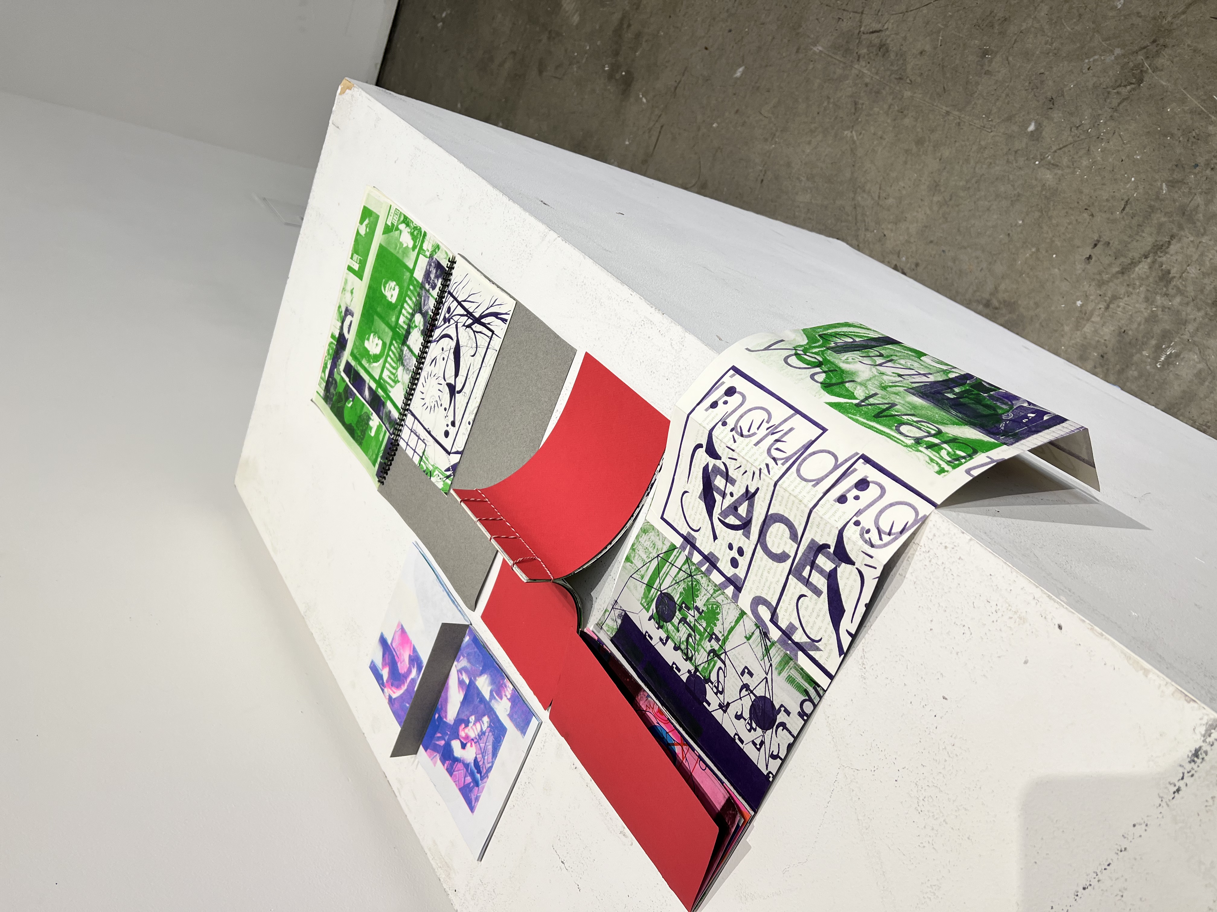
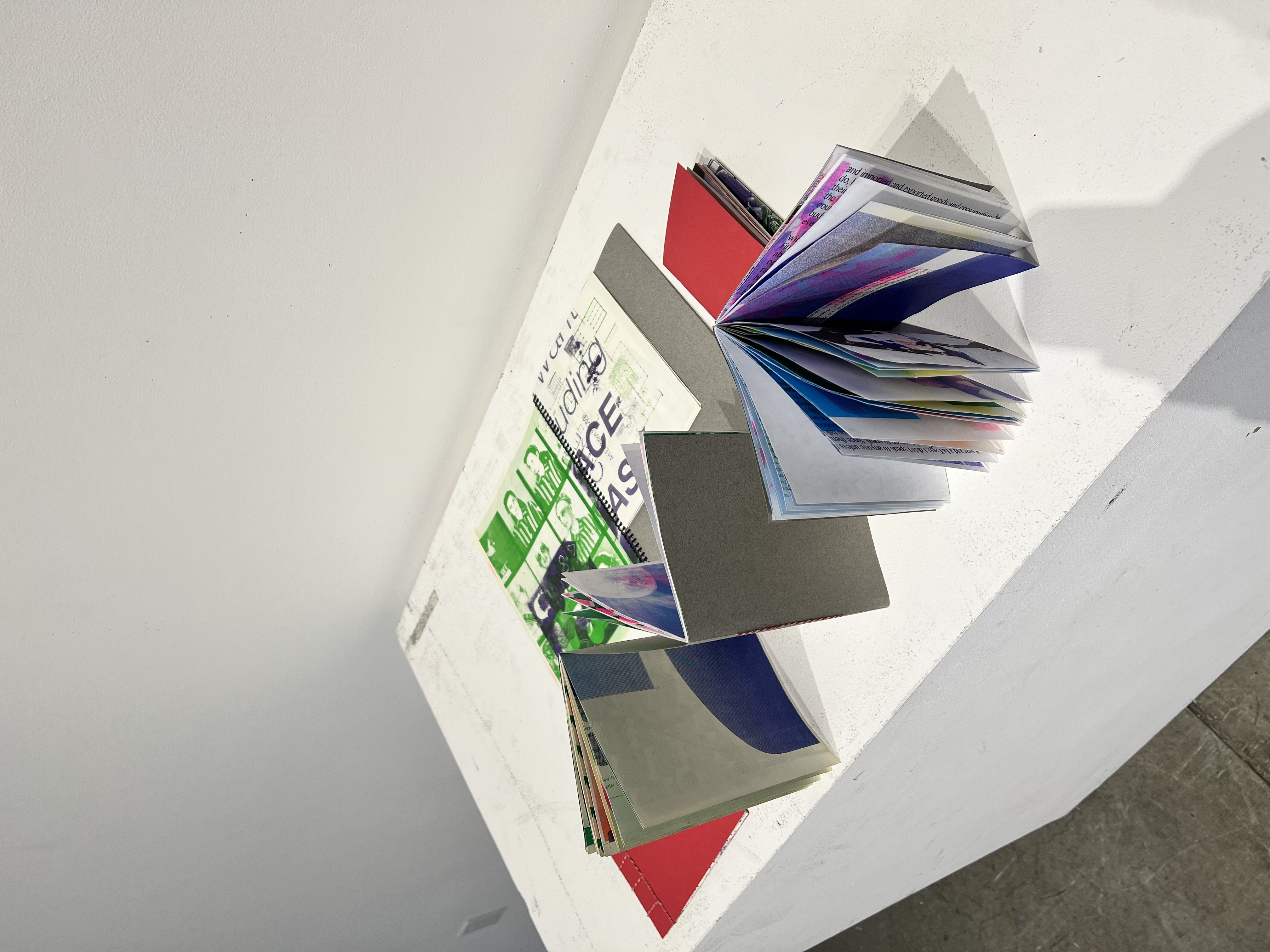
What’s wild is that these prints are often some of the most incredible things I’ve seen at CCA. With Garbage Time, I give these trash pages/players another chance to perform by curating a series of pages and making books with them. The covers feature a red or charcoal cardstock, bound with red and white braided thread. This constrained color pallet serves as the uniform for my team. As the campus-wide Riso, the prints used had a ton of variation. Some prints were from Spring 2020 before classes went remote during quarantine. Both students and professors have told me that something they did was featured in my books. Perhaps I’ll use another color pallet and start a garbage time rivalry in the future.
KICK IT


Kick It is a type study of the black and white geometric pattern on soccer balls. The Truncated Icosahedron is a 3D form with 12 pentagonal faces, 20 hexagonal faces, 60 vertices, and 90 edges. Geodesic domes, such as those created by Buckminster Fuller, are based on this geometry.
As an hommage to this pattern and polyhedron, I used a modular approach to create a typeface that deploys pentagons and hexagons in a 3 to 5 ratio.
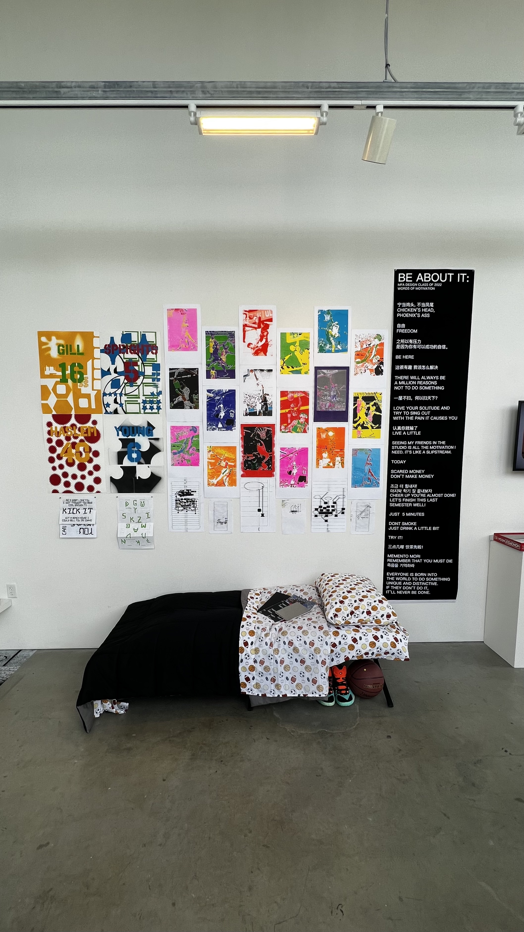
BE ABOUT IT

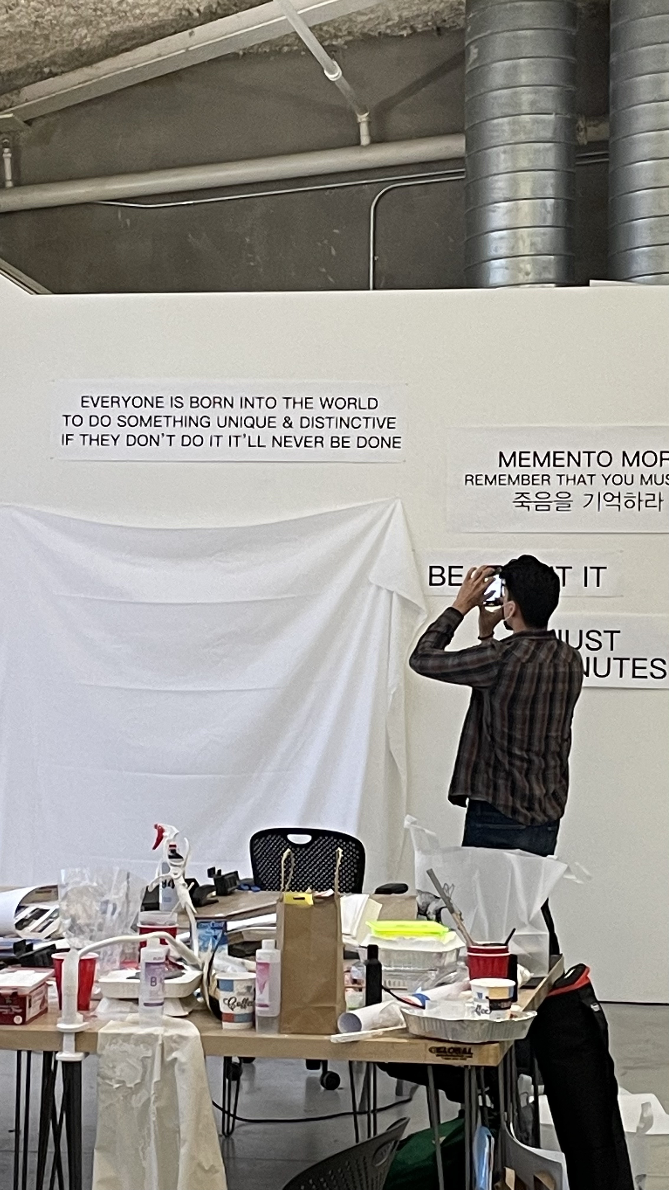
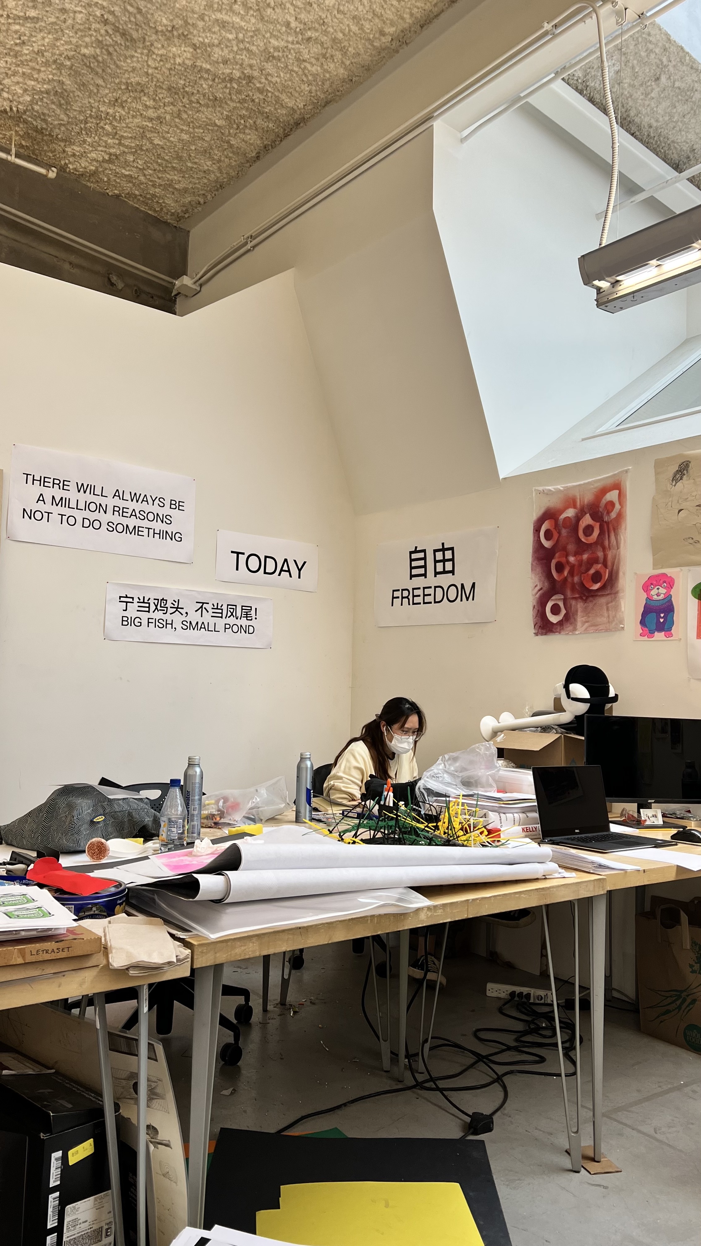
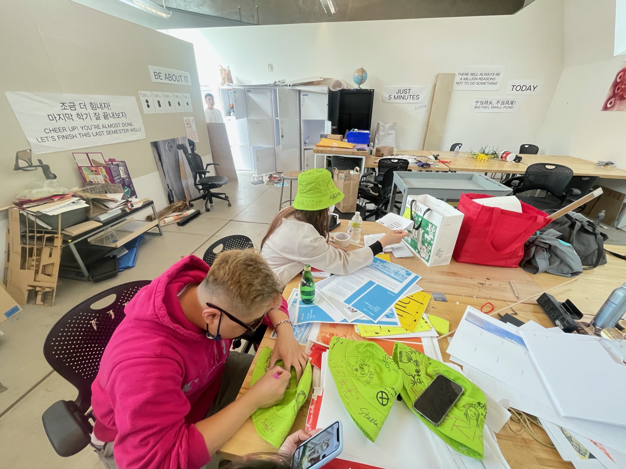
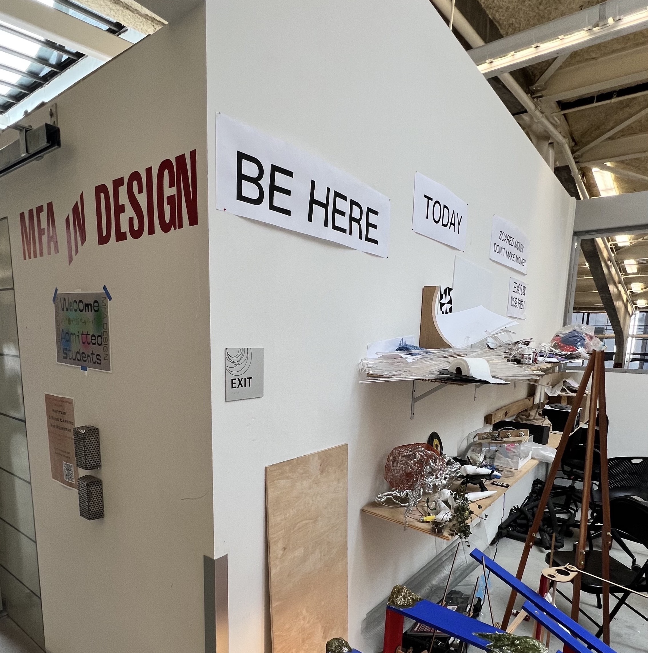
I’ve learned much about and from my classmates these past three years of hybrid learning. As we closed in on finals, our thesis show, and graduation, I wanted to help the team remember things that always escape our brains. I asked them -- “Is there anything that you need to be reminded of?” or “Do you have any quotes you constantly find yourself returning to for motivation.” Together we created a list of about 20 phrases that were printed and pinned up over the studio. When the phrases first went up, they were loud and a bit overwhelming, but as time passed, they proved to match the energy of the studio, in which the finality of our experience played a heavy overtone.
THESIS EXHIBITION INSTALL